Untangling Complexity
- My Role
- Lead UX Designer
- Timeline
- 2025 – 26
- Key Metric
- 50×
- Faster workflows reported by beta pilot customers
Core challenge
Supply Chain · Enterprise UX
At a glance
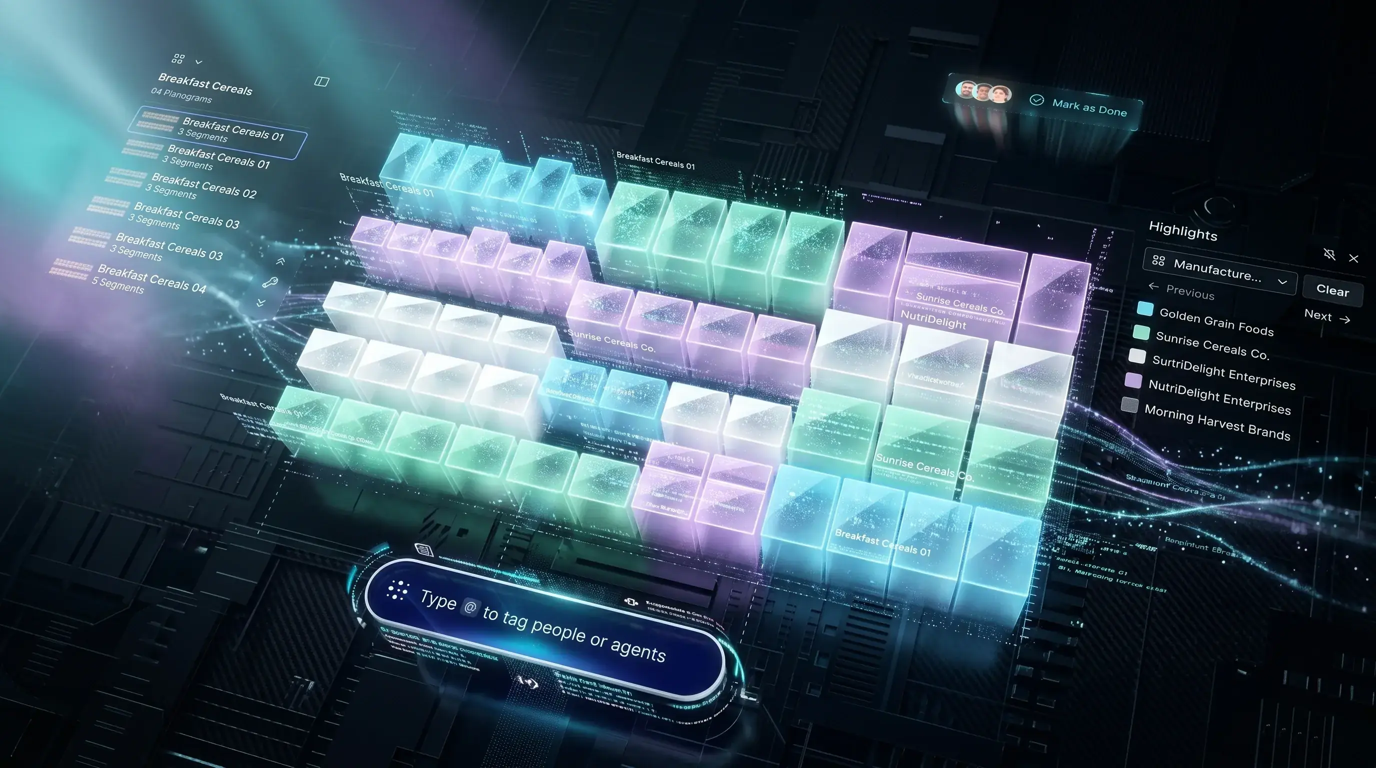
Final solution at a glance
50×
Faster workflows reported by beta pilot customers
300+
Screens delivered across Designer + Optimizer
25+
New Fractal design system components
ICON 25
Customer validation with live prototype testing
01 — The Problem
What is Microspace Planning and who uses it?
Blue Yonder's Microspace Planning application is used by category managers, space planners (both from retail chains and their suppliers), and platform admins. Their job: design and optimise planograms — the precise shelf layouts that determine where every product sits in a retail store. The stakes are high. A single planogram decision ripples across thousands of store locations and directly impacts sales performance.
No Canvas Tooling
Planogram design happened in a rigid, non-interactive grid. No canvas. No drag-and-drop. No zoom. No spatial context for the planner.
Top-Ribbon Menu Hell
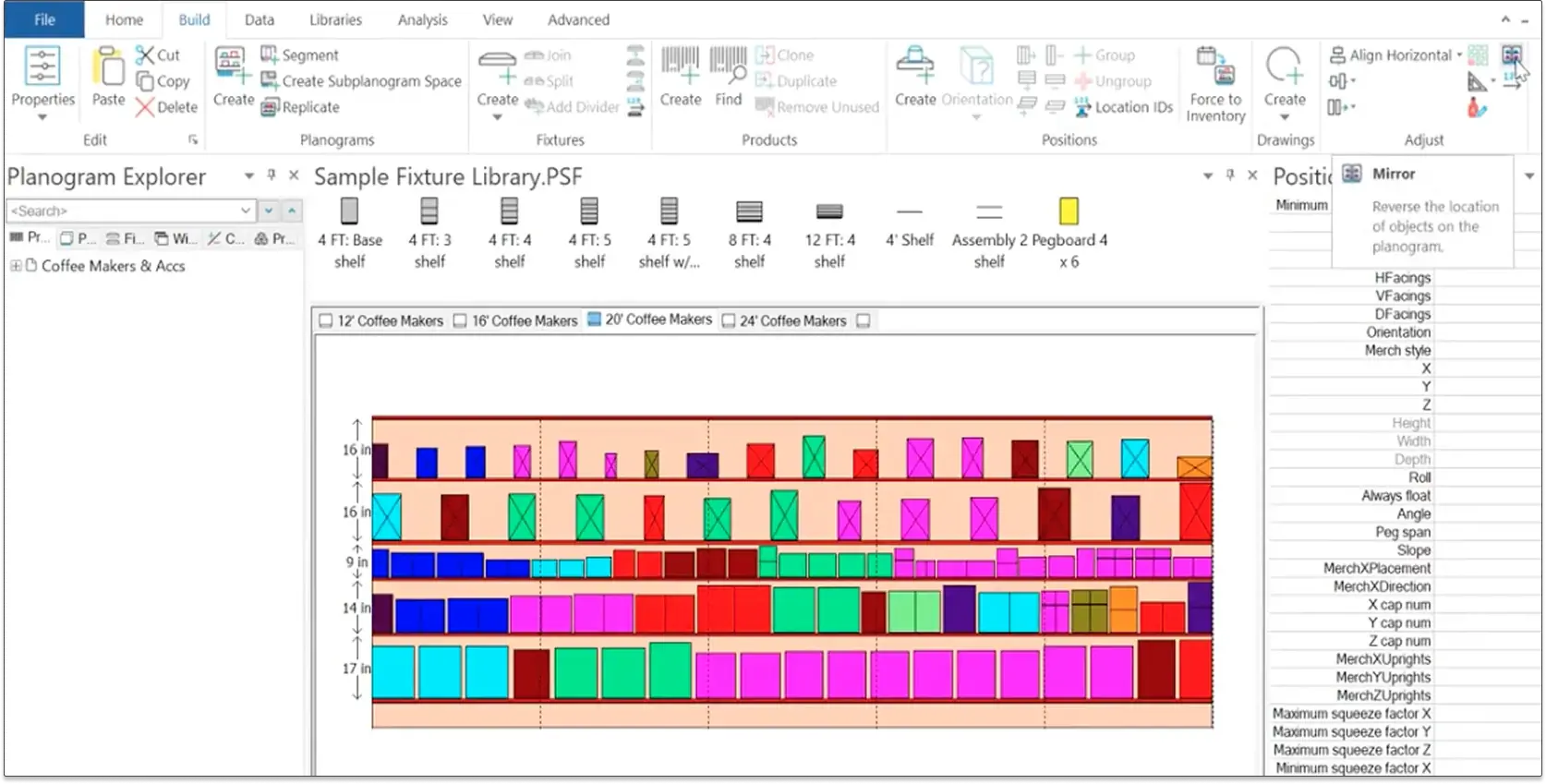
Every action was buried in nested top-ribbon menus. Nothing was contextual. Users had to remember where features lived rather than discovering them naturally.
Zero Collaboration
Multiple planners couldn't work on the same file. Cross-team coordination happened via phone and email — completely outside the product.
No Automation
Every bulk change — updating a brand's shelf space, resetting a category — had to be done manually, one planogram at a time.
A tool powerful enough to frustrate its best users.
The old application wasn't broken — it was overwhelmingly complete. Every feature existed. Nothing was easy to find. Everything required a menu. Nothing was contextual. The result was an experience that demanded expertise just to navigate, and punished users who wanted to move fast.
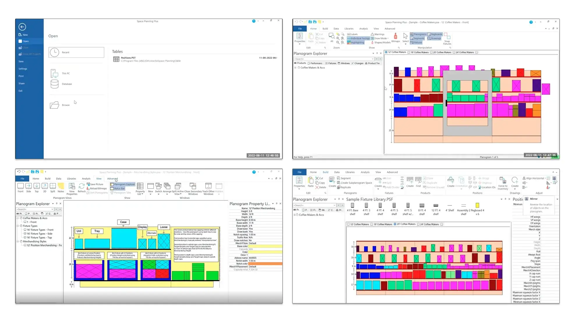
Legacy Microspace Planning — the application before the revamp. Dense ribbon menus, no canvas, manual workflows.
02 — Role & Process
How I approached a revamp of this scale.
The revamp began with an audit — not assumptions. I mapped every screen, every menu item, every workflow in the legacy application. Connected all the dots. Identified the redundancies. Then worked with the research team to schedule structured connects with all three user groups: category managers, space planners, and admins. The PMG had a clear phased roadmap. My job was to translate that into a coherent, modern experience — phase by phase.
Audit
Catalogued every screen, menu, and interaction in the legacy desktop application. Mapped redundancies, identified friction points, and created a complete picture of what existed before designing anything new.
Research
Scheduled structured sessions with Category Managers, Space Planners (both supplier and retailer side), and Admins. Uncovered core pain points: lack of automation, information overload, non-contextual UI, and collaboration gaps.
Architecture
Threw out the top-ribbon model entirely. Designed a contextual navigation system where options surface based on what the user is doing — not what the menu hierarchy dictates.
Design
Introduced the planning canvas, real-time collaboration via Liveblocks, ShelfOps Agent integration, and vibe planogramming. Defined new components for the Fractal design system — canvas, collaboration, and agentic patterns that didn't exist before.
Validation
First-cut design concept was presented at ICON 25 — Blue Yonder's annual customer conference. Real customers used the prototype. Insights gathered directly shaped the final product direction.
Delivery
Delivered ~300+ screens across Designer and Optimizer workflows. Integrated Pendo for analytics and built in-app onboarding. Beta pilot customers reported 50x faster workflows in collaboration, communication, bulk updates, and optimization.
03 — Design Decisions
The calls that defined the product.
With no direct competitor UI to reference — this category of enterprise tool is closed and proprietary — every major decision had to be grounded in user research, first principles, and deep domain understanding.
Abolish the Ribbon. Go Contextual.
The top-ribbon menu was the root cause of almost every usability complaint. The replacement wasn't just a visual change — it was an architectural one. Every action now surfaces contextually: right-click on a product, options for that product appear. Select a shelf, shelf options appear. Nothing is ever more than one intentional action away. Outcome: Reduced clicks-to-action by design
Introduce the Planning Canvas
The most important missing capability in the old product. A true canvas — with drag-and-drop, zoom, spatial relationships, and contextual tooling — transformed how planners interact with their work. This also required defining an entirely new set of canvas components for the Fractal design system from scratch. Outcome: New canvas component system built and shipped
Make Collaboration a First-Class Feature
Real-time collaboration via Liveblocks wasn't just a feature add — it replaced an entire workflow. Email chains, phone calls, and locally-saved files gave way to presence indicators, live cursors, shared sessions, and in-canvas commenting. The collaboration patterns had to be designed from zero — no precedent in the Fractal system. Outcome: 50x faster collaboration reported by beta customers
Minimal Screen · Maximum Context
With no open competitor references to benchmark against, the design principle became: show only what the user needs, exactly when they need it. Dense information panels were replaced with progressive disclosure. The canvas breathes. Options arrive at the right moment. The result: a planner can focus on planning — not on the tool. Outcome: Validated at ICON 2025 with live customer feedback
04 — Before & After
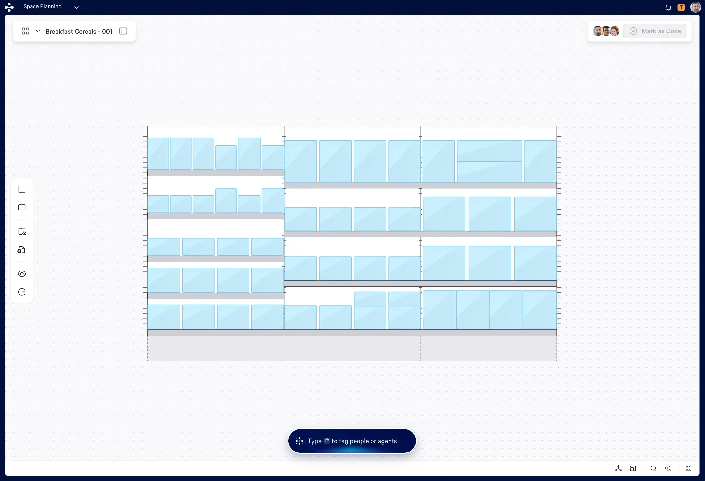
Before & After
05 — Key Screens
300+ screens. Here are the ones that matter most.
The revamp covered the full Designer and Optimizer workflows for Microspace Planning — approximately 300+ screens in total. Below are the moments in the product that represent the biggest design leaps from the legacy experience.
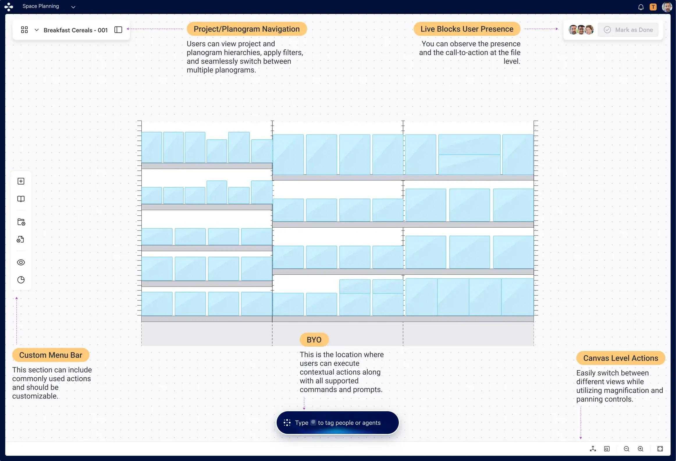
Planning Canvas — Designer
The hero screen of the revamp. A full spatial canvas where planners design planograms with contextual tooling that surfaces only when needed. No ribbon. No clutter.
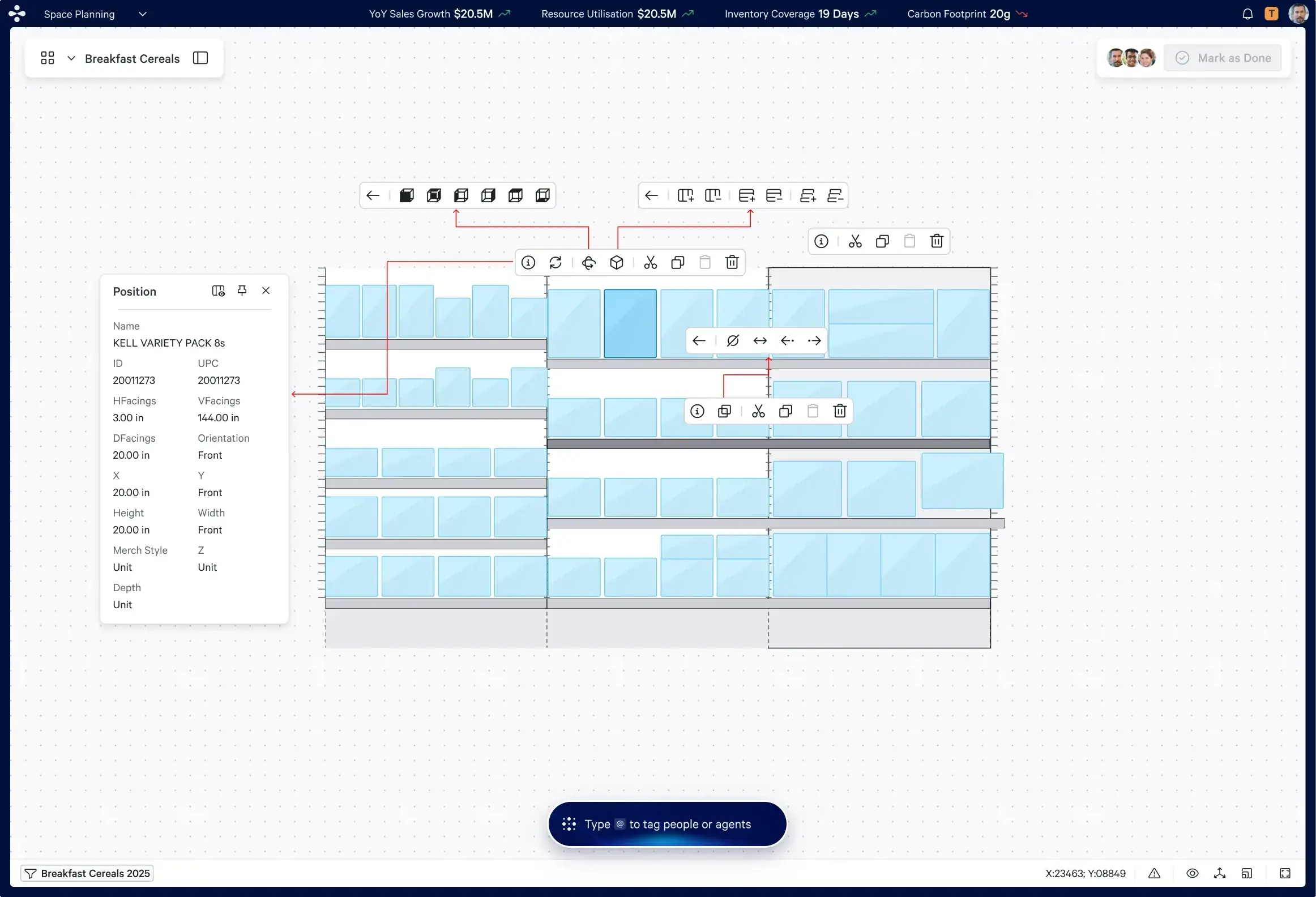
Contextual Interaction Model
When a user selects an element on canvas, only the relevant options for that element appear — inline, immediately, without menus. This replaced the entire top-ribbon system.
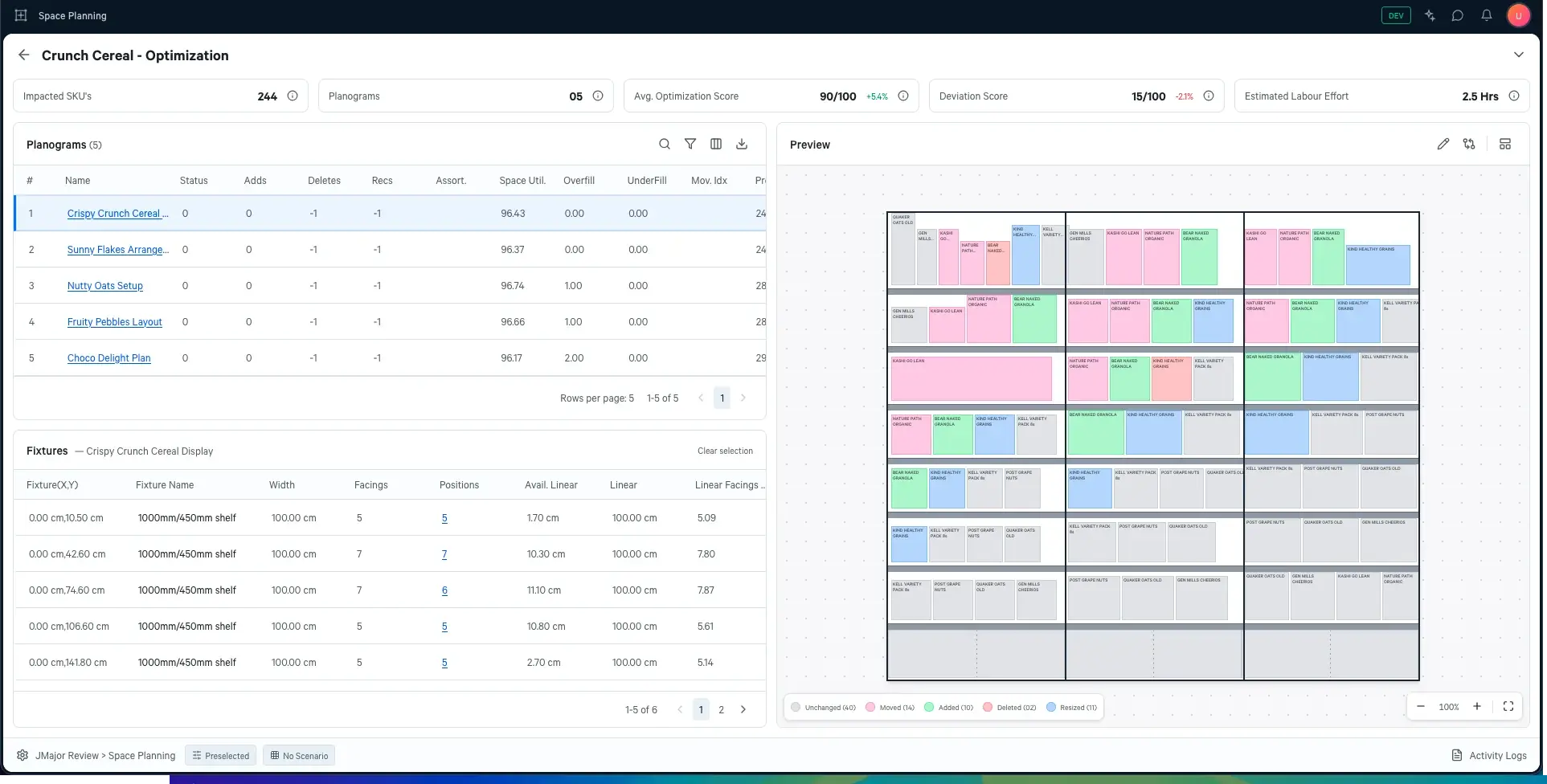
Optimizer — Setup to Results
The Optimizer workflow guides planners through constraint setup, run configuration, and results review — surfacing algorithmic output in a clear, actionable format.
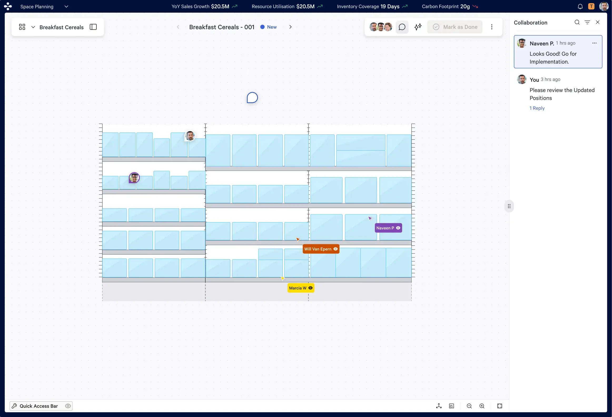
Real-Time Collaboration
Multiple planners visible on the same canvas simultaneously. Presence indicators, live cursors, and shared sessions replaced email chains and phone calls.
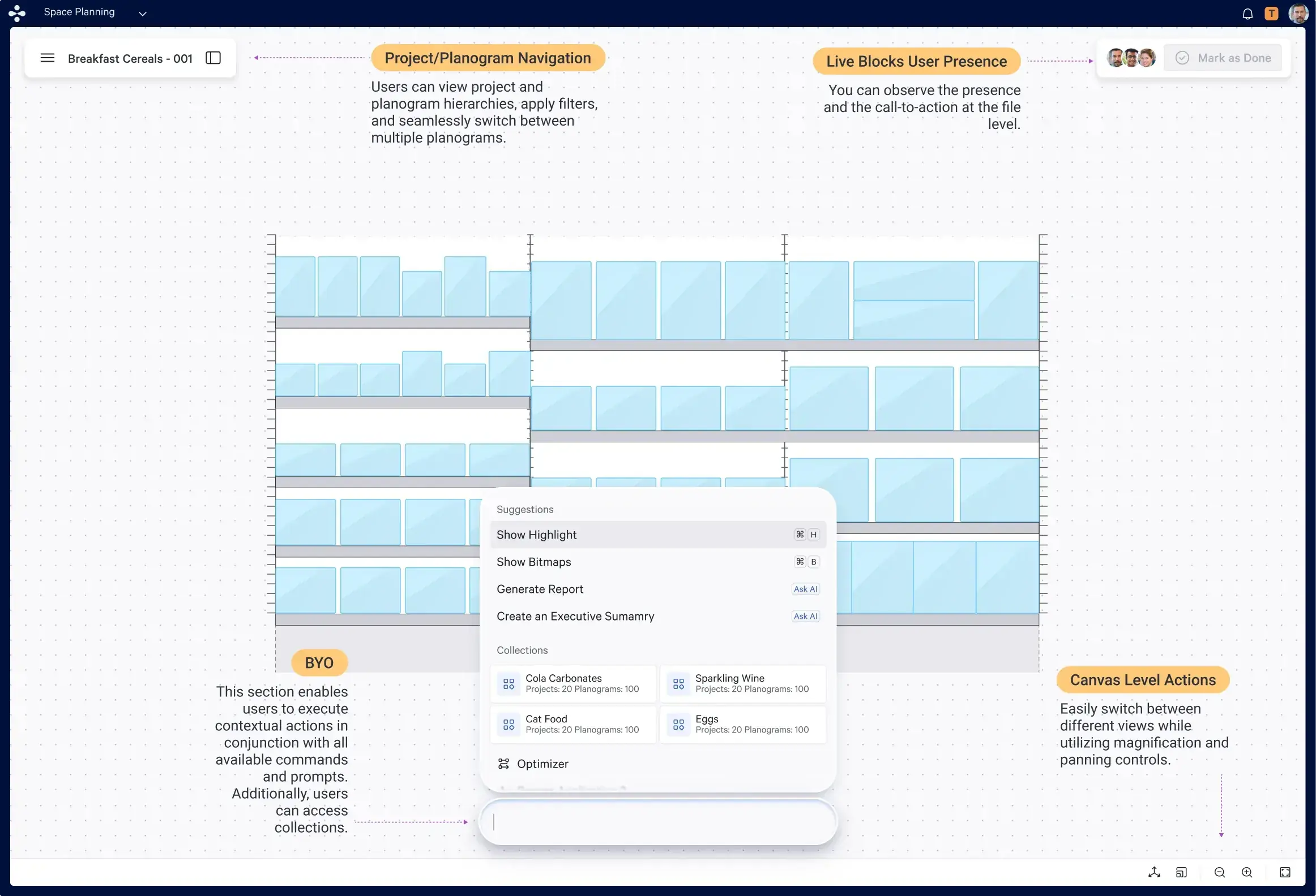
Agentic UX — ShelfOps Agent on Canvas
The ShelfOps Agent integrated directly into the planning canvas — enabling vibe planogramming: describe what you want, the agent proposes it, you approve and refine.
06 — Design System
Building what didn't exist yet.
The Fractal design system had no precedent for canvas-based planning, real-time collaboration, or agentic UX. Every pattern introduced in this project had to be defined from scratch — and built to be reusable across the entire CATMAN suite.
New Components
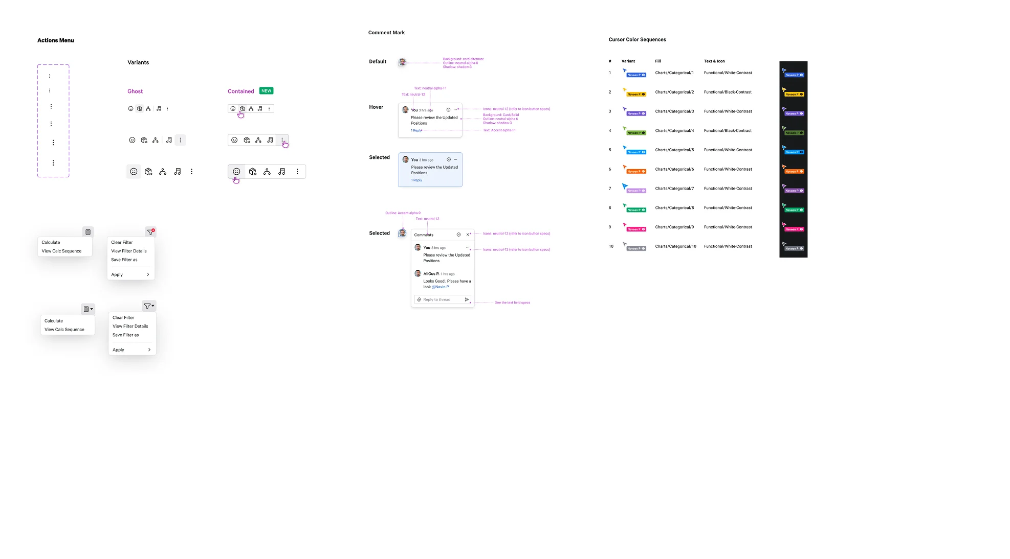
Canvas blocks, toolbars, context menus, presence indicators, agent panels, optimizer cards — all new to the Fractal system.
New Pattern Categories
Canvas interaction patterns, real-time collaboration patterns, and agentic UX patterns — none of which existed before this project.
Screens Delivered
Across Designer and Optimizer workflows for Microspace Planning — from first-concept to shipped product.
07 — Impact
Validated by customers. Measured in time saved.
The first-cut design was presented live at ICON 2025 — Blue Yonder's annual customer conference — where real customers used the prototype and shared direct feedback. That feedback shaped the final product. Post-launch, Pendo analytics and beta pilot feedback told the rest of the story.
50×
Faster workflows reported by beta pilot customers
300+
Screens delivered across Designer + Optimizer
25+
New Fractal design system components
ICON 25
Customer validation with live prototype testing
08 — Reflection
What I learned redesigning at scale.
Biggest Design Decision
Abolishing the ribbon menu was the highest-risk call. It meant rebuilding the entire navigation mental model that existing users had learned over years. But every research session confirmed it — the ribbon was the problem, not the solution. The contextual model was the only right answer.
What I'd Do Differently
Start the design system contribution conversations earlier. Defining 25+ new components mid-project while simultaneously delivering screens created pressure that could have been reduced with earlier alignment on the component roadmap.
What This Project Taught Me
Enterprise UX at this scale isn't just interface design — it's change management. You're asking thousands of users to unlearn deeply embedded habits. Every design decision has to justify itself not just aesthetically but behaviourally. The canvas wasn't just a feature. It was a new way of thinking about planning.
Tools & Methods
Figma · FigJam · Pendo analytics · Liveblocks · Blue Yonder Fractal design system · Application audit method · User research sessions (3 persona groups) · ICON 2025 live prototype validation