Fractal Design System
- My Role
- Core Contributor
- Timeline
- 2024 – 2026
- Key Metric
- 58
- Components shipped
Core challenge
10+ Products · 150+ Practitioners served
At a glance
Final solution at a glance
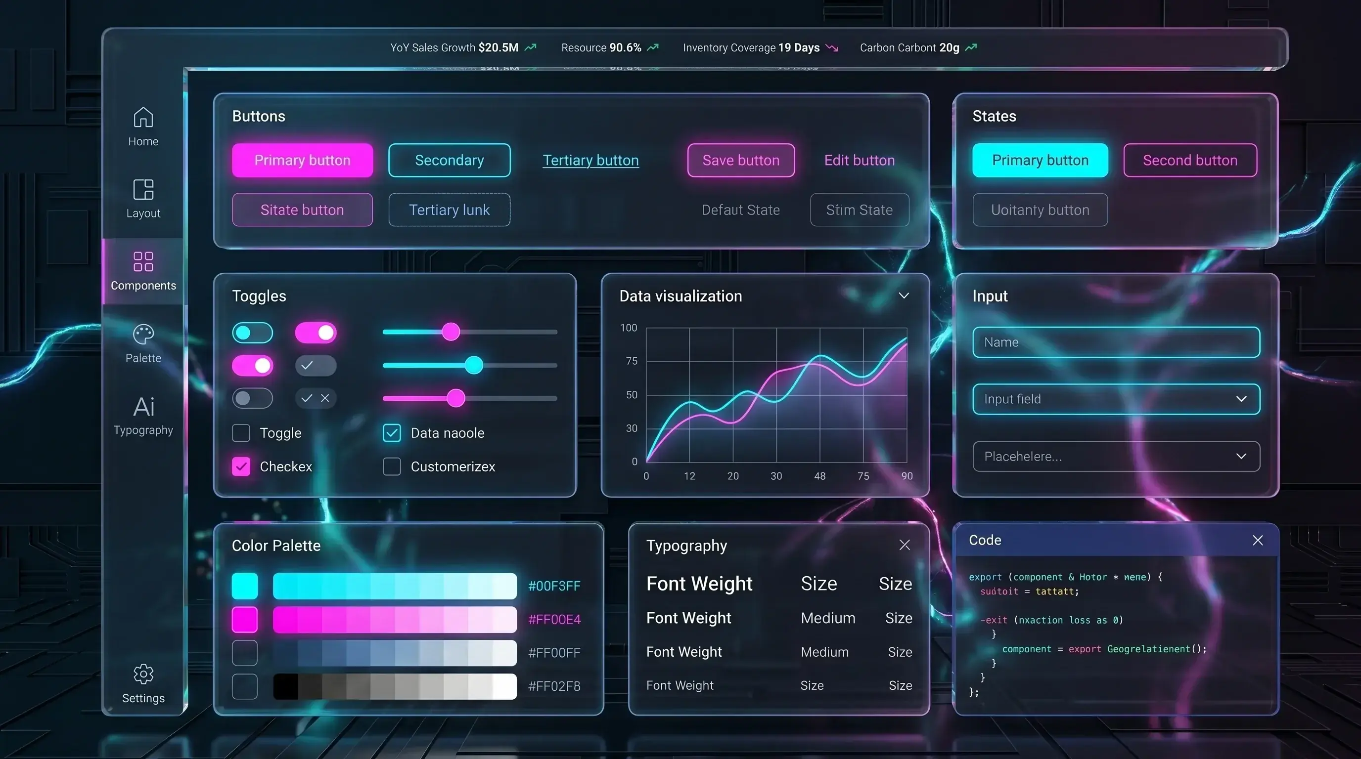
58
Components shipped
10+
Products adopted
6
Token dimensions
50%
My contribution to library
01 — The Problem
What is Fractal and why did it exist?
Blue Yonder's product suite serves the world's largest supply chain and retail operations — companies like Walmart, DHL, and Carrefour. With 10+ distinct products and over 150 designers and engineers working across them, the experience had fragmented over years of independent team decisions. Fractal was the answer: an enterprise design system built to unify them.
What It Is
Fractal is Blue Yonder's enterprise design system — a shared language of tokens, components, and patterns that powers consistent UI across the entire product portfolio. Named for the mathematical concept of self-similar structures that repeat at every scale, just as Fractal's atoms compose into molecules, and molecules into full application surfaces.
Who It Serves
Every designer and engineer working across Blue Yonder's 10+ enterprise products — from supply chain planning tools to warehouse management and retail execution platforms — touching 150+ practitioners across multiple global teams.
At What Scale
A single token change — say, updating a brand colour or border radius — propagates instantly across every component, every product, and every platform consuming Fractal. What used to require weeks of find-and-replace across codebases now happens in a single Style Dictionary build.
02 — The Problem
Fragmented. Inconsistent. Impossible to maintain.
Before Fractal existed, every product team at Blue Yonder operated its own ad-hoc design language. There were no shared tokens, no governed component library, and no standard for how design decisions moved into engineering. The cost was measured in rework, in bugs, in onboarding weeks, and in user confusion when moving between products.
No Shared Visual Language
Each product had its own colour definitions, spacing scales, and type choices — all hardcoded. Moving between Blue Yonder products felt like switching between companies.
Inconsistent Components
Buttons, tables, modals, and form inputs existed in dozens of variations across products — no single truth, no reuse, just duplication and drift with every sprint.
Slow, Error-Prone Handoff
Designers spec'd components from scratch in every file. Engineers re-implemented them from scratch in every codebase. The same decisions were made, argued over, and reversed weekly.
No Token Infrastructure
Colours, spacing, and typography were hardcoded as raw hex values and pixel numbers throughout. A brand refresh or theme change required touching hundreds of files across every product.
Accessibility Was an Afterthought
Without a system enforcing WCAG 2.1 AA standards at the component level, accessibility fixes were reactive — found in QA or worse, in production — rather than built in by default.
Onboarding Was Weeks, Not Days
New designers and engineers joining any product team had no shared foundation to learn from. Every team had its own undocumented conventions, patterns, and tribal knowledge.
03 — The System
Fractal's architecture: tokens, atoms, molecules.
Fractal was designed around a single principle: every decision made once should never need to be made again. The system is organized into three tiers — tokens, atoms, and molecules — each building on the next, independently maintainable and collectively coherent.
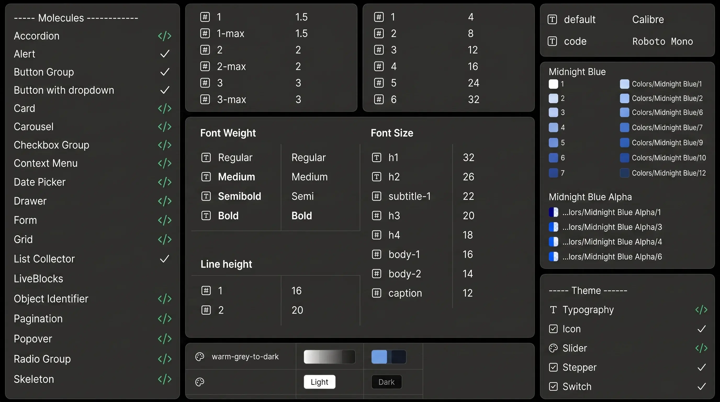
Fractal's three-tier architecture: Tokens → Atoms → Molecules
The system in numbers.
A three-tier token architecture and a governed component library — the two subsystems that carry Fractal's promise of consistency. Three tiers of tokens turn raw values into semantic meaning; 58 components cover the everyday interface language; six theme dimensions keep the system adaptable to any product.
Token Architecture
Three-tier token system: Global tokens define raw values (hex colours, px sizes). Semantic tokens assign meaning (color-primary, spacing-md). Component tokens bind semantics to specific component slots (button-bg, input-border-radius). All managed in Token Studio and compiled via Style Dictionary into CSS custom properties, consumed by engineering directly.
Component Library
58 components total across two tiers: 18 atoms (Avatar, Badge, Button, Checkbox, Chips, Circular Progress, Divider, Semantic Indicator, Icon Button, Linear Progress, Object Status, Radio, Scrollbar, Search, Select, Text Area, Text Field, Tooltip) and 40 molecules (Accordion, Card, Date Picker, Modal, Table, Tabs, and 34 others). Every component ships with Figma variants, Storybook documentation, and an engineering implementation.
Theming & Token Dimensions
Token architecture supports Colour, Typography, Spacing, Breakpoints, Border Radius, and Elevation — six theme dimensions manageable independently, enabling product-level theming, dark mode, and future multi-brand support without touching component code.
04 — Token Architecture
Three tiers. One source of truth.
The token system is Fractal's most strategic layer — the bridge between brand decisions, design intent, and engineering implementation. Built as a three-tier hierarchy, it separates raw values from their meaning, and meaning from their application.
Global Tokens
Raw values with no semantic meaning — the full palette, the complete spacing scale, every typeface and size. Examples: color-blue-500: #1D9E75 · space-4: 16px · font-size-lg: 18px. Single source of raw design decisions. Changed once here, propagated everywhere downstream.
Semantic Tokens
Named by purpose and intent, not by value. They map to global tokens and give design decisions their meaning. Examples: color-primary: {color-blue-500} · spacing-component-md: {space-4} · text-body: {font-size-lg}. Decouples visual decisions from their application — enabling theming, dark mode, and brand changes without touching component definitions.
Component Tokens
Slot-specific bindings that connect semantic tokens to exact points within individual components. Examples: button-background: {color-primary} · input-border-radius: {radius-md} · card-padding: {spacing-component-md}. Allows component-level customization without breaking the system — a product team can adjust card padding without forking the entire component.
A single component. Every layer of the system.
— Anatomy in practice
05 — Component Library
58 components. Two tiers. One contributor drove half.
Fractal's component library is structured around atomic design principles — atoms compose into molecules, molecules compose into full interfaces. Every component exists in three places simultaneously: as a Figma component with full variant coverage, as a Storybook documentation page with usage guidelines, and as an engineering implementation consumable by any product team.
18
Atoms
40
Molecules
58
Total
50%
My contribution
Atoms · 18
Molecules · 40
Design to engineering, without translation loss.
Every component in Fractal lives in two canonical places: as a fully-specified Figma component with complete variant and state coverage, and as a production-ready implementation documented in Storybook. Figma is where design decisions are made and governed — engineers go to Storybook to consume them. The two are kept in deliberate parity: same component names, same variant terminology, same state vocabulary. A designer referencing Button / Primary / Disabled and an engineer reading button variant="primary" disabled={true} are working from the same source of truth, just through different surfaces.
Figma Component Library
Where components are designed, variants defined, and design decisions governed.
Storybook
Where engineering implementations live — interactive controls, usage guidelines, do/don't examples, and accessibility notes all in one place.
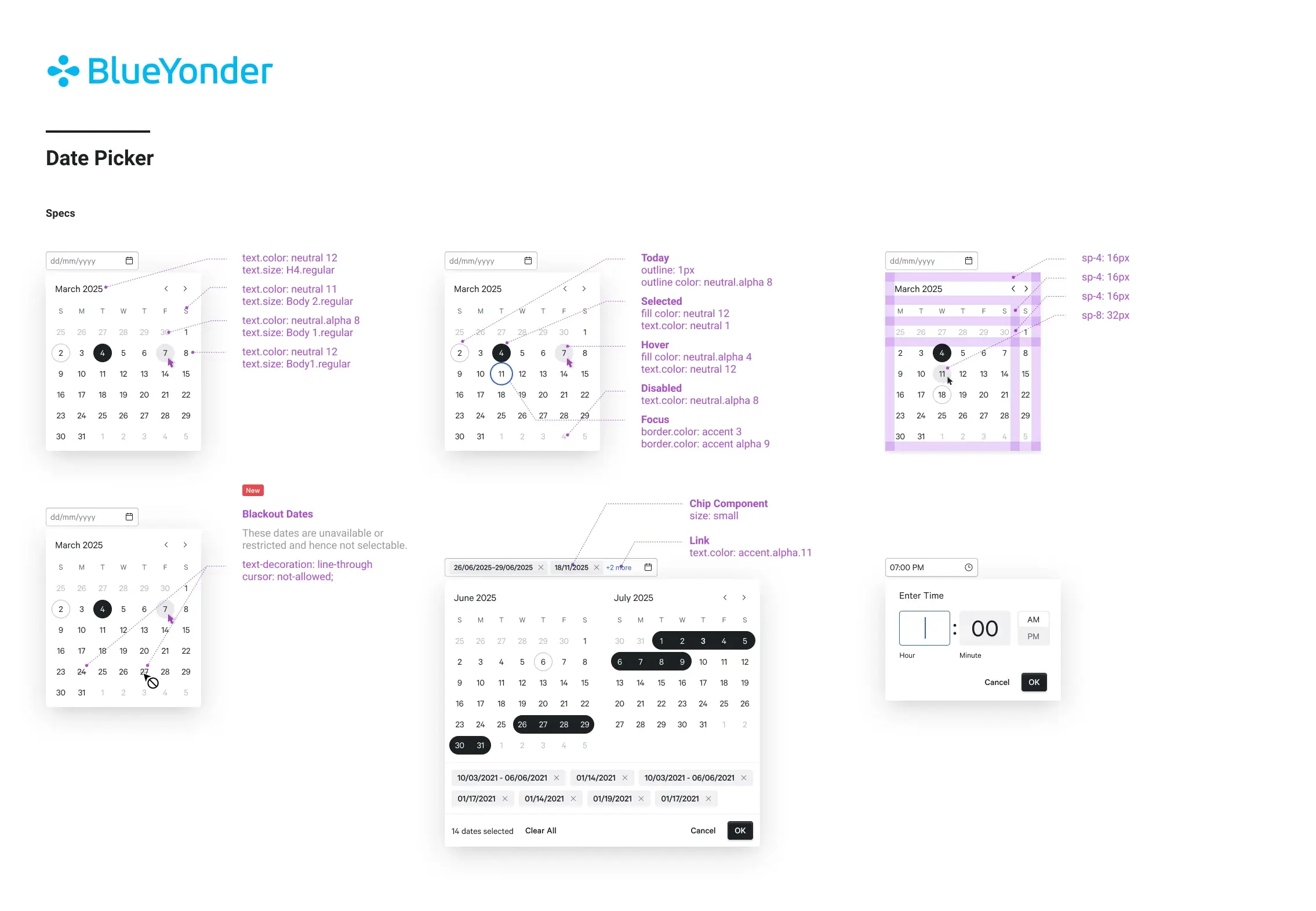
Figma component library with variant panel — states, sizes, types.
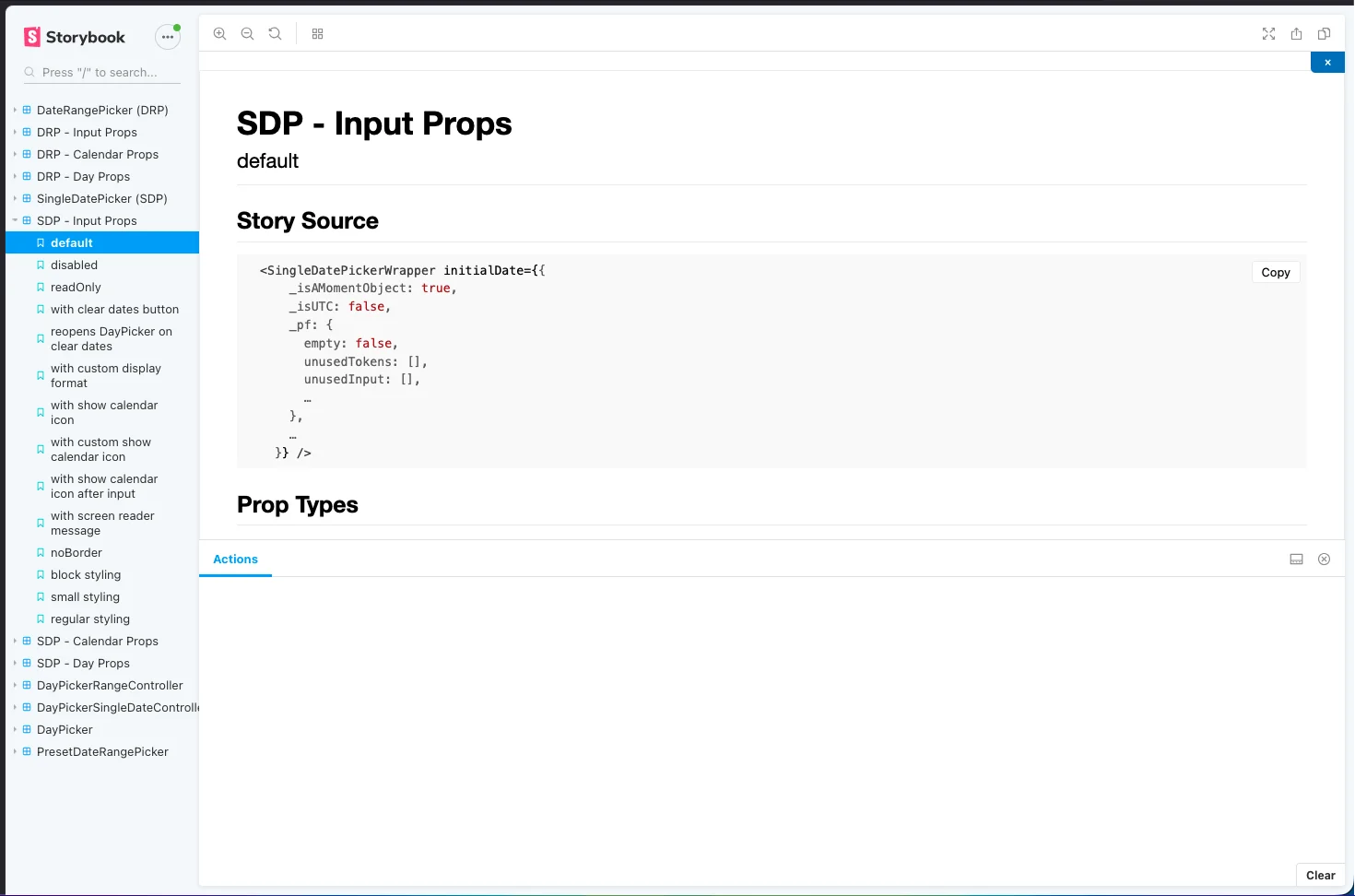
Storybook documentation — interactive controls, usage guidelines, and accessibility notes.
Left: Figma — where design decisions are made and governed. Right: Storybook — where engineering implementations are documented and consumed.
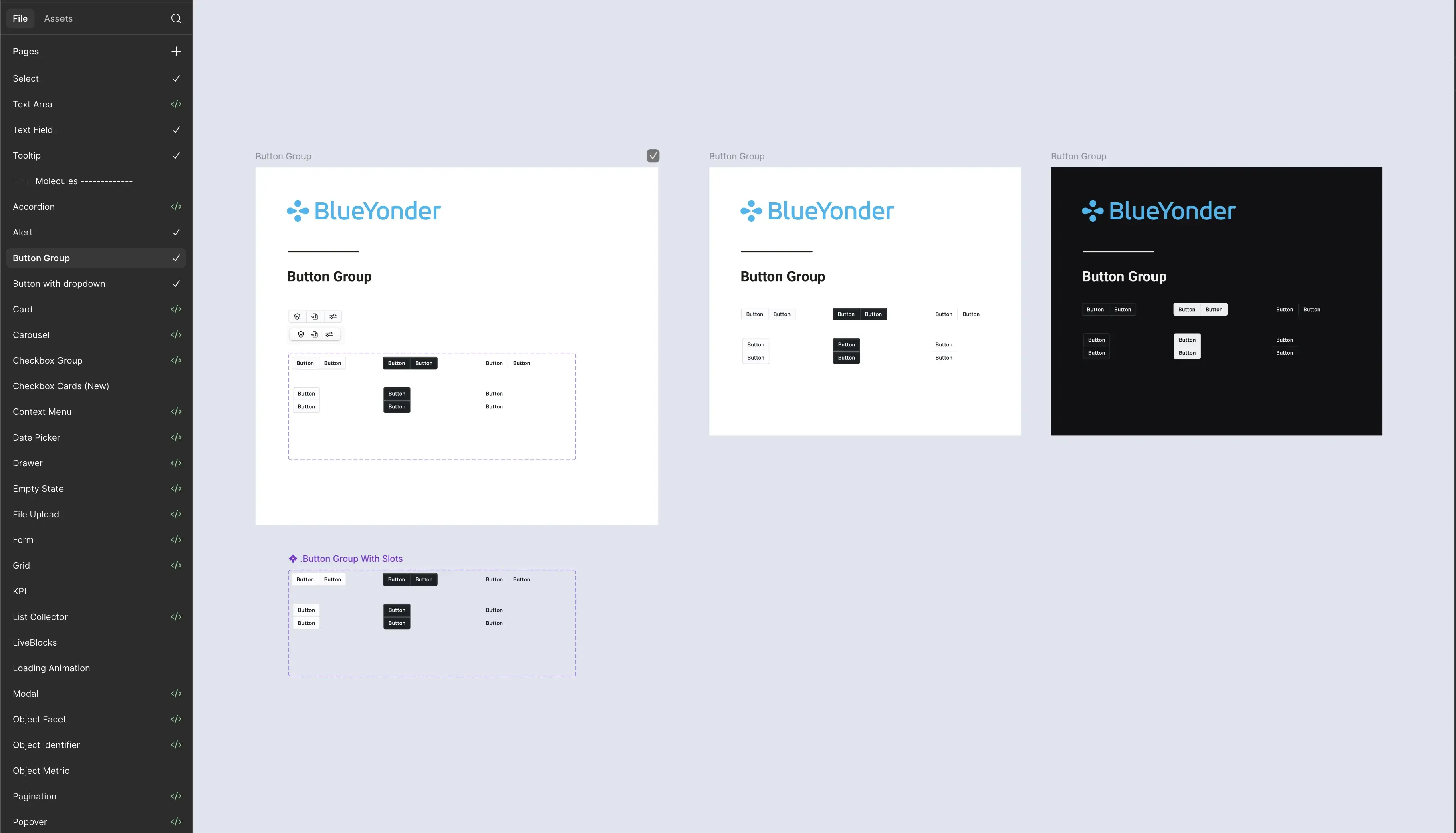
Fractal component library in Figma — dark sidebar with green </> engineering indicators
06 — Accessibility
WCAG 2.1 AA. Built in, not bolted on.
Colour Contrast
Every colour token pairing in Fractal's semantic layer is validated against WCAG 2.1 AA contrast ratios (4.5:1 for text, 3:1 for UI components). Tokens that fail the threshold are blocked at the system level — they cannot be assigned to text roles.
Keyboard Navigation
Every interactive component — buttons, form inputs, modals, menus, date pickers — ships with complete keyboard navigation built in. Tab order, focus management, escape key behaviour, and arrow key navigation are defined at the component level, not left to implementing teams.
Screen Reader Support
ARIA roles, labels, and live region announcements are part of every component's specification. Components like Alert, Empty State, and Loading Animation include live region support. Form components ship with associated label patterns by default.
Semantic Indicator Component
Fractal includes a dedicated Semantic Indicator atom — a component specifically designed to communicate status (success, warning, error, info) through both colour and iconography simultaneously, never colour alone. Directly addresses WCAG 1.4.1 (Use of Color).
Accessibility in Fractal isn't a checklist — it's a constraint baked into every component's definition. By encoding WCAG 2.1 AA compliance at the system level, every product consuming Fractal inherits accessible behaviour without each team needing to audit independently.
07 — Governance & Adoption
How Fractal scaled across 10+ products without fracturing.
A design system without adoption is a style guide. The governance model that grew around Fractal was as deliberate as the components themselves — built to lower the barrier to contribution while maintaining the quality bar that made the system trustworthy.
Contribution Model
Any product team could propose a new component or token change via a structured RFC (Request for Component) process. Proposals included usage rationale, variant specifications, and edge case documentation. The core Fractal team reviewed, iterated, and either merged or provided an alternative pattern.
Storybook as Living Documentation
Every engineering-implemented component (marked </> in the library) lives in Storybook with interactive controls, usage guidelines, do/don't examples, and accessibility notes. Storybook is the contract between design and engineering — the authoritative reference when a discrepancy arises.
Versioning & Deprecation
Components follow semantic versioning. Breaking changes are communicated with a deprecation window — product teams receive advance notice, migration guides, and codemods where applicable. No team was ever surprised by a breaking system update.
Office Hours & Onboarding
The Fractal team ran regular office hours — open sessions where product designers and engineers could bring questions, propose patterns, or review in-progress work. New team onboarding included a dedicated Fractal orientation covering token usage, component selection logic, and the contribution workflow.
08 — Engineering Collaboration
Design and engineering, speaking the same language.
Fractal's value was only fully realised when design decisions moved into production without loss of fidelity. The pipeline between Figma, tokens, and the React component library was deliberately engineered so that the system could scale without the design team becoming a bottleneck for every engineering question.
Token Pipeline
Token Studio (Figma) → Style Dictionary → CSS custom properties → React component props. Design decisions made in Figma propagate to production via an automated build step — no manual translation, no interpretation gap.
Figma ↔ Code Parity
Every component in Figma mirrors its engineering implementation — same variant names, same prop names, same state names. A designer referencing "Button / Primary / Disabled" is using the exact same language as the engineer referencing button variant="primary" disabled={true}.
Storybook as Handoff
Storybook replaced static redline annotations entirely. Engineers interact with live components, adjust props, inspect behaviour, and read usage guidelines — all in one place. Handoff became a conversation, not a document.
React Consumption
Fractal's component library is consumed as a versioned npm package across all React-based products. Teams import what they need, override via component tokens where required, and receive upstream updates through standard package versioning.
09 — Impact
What shipped and what it changed.
58
Components shipped
10+
Products adopted
6
Token dimensions
50%
My contribution to library
AA
WCAG 2.1 accessibility standard met
150+
Practitioners served
10 — Reflection
What I learned building at system scale.
Biggest Design Decision
Structuring the token architecture as three tiers rather than a flat list was the call that made everything else possible. Semantic tokens are what allow theming, dark mode, and white-labelling without touching component definitions. Without that abstraction layer, every brand change becomes a global find-and-replace. With it, it's a single token swap.
What I'd Do Differently
Push for AI-readiness earlier in the token architecture. A token system where names, values, and relationships are machine-readable from day one is the foundation for generative UI — AI tools that can assemble compliant interfaces by referencing the token graph. Fractal has the structure for this; the tooling integration is the next frontier.
What This Project Taught Me
Design systems are fundamentally trust infrastructure. Every token, every component, every governance decision is a promise made to every team that consumes the system. When that promise is kept — when the Button component works exactly as documented, when a token change propagates correctly, when a new team onboards in days not weeks — the system earns the authority to scale. Break that trust once and teams fork. Keep it and they contribute.
Tools & Methods
Figma · Token Studio · Style Dictionary · Storybook · React · WCAG 2.1 AA audit · Component RFC process · Office hours · Semantic versioning