Banking at Enterprise Scale
- My Role
- UI Designer & Design System Lead
- Timeline
- 2019 – 22
- Key Metric
- 5
- Banking service modules covered end-to-end
Core challenge
FinTech · Accessibility
At a glance
Final solution at a glance
5
Banking service modules covered end-to-end
4
User personas served by one unified system
AAA
WCAG colour contrast compliance achieved
6 mo
Full design system + UI screens delivered
01 — The Problem
What is Infinity Assist and who uses it?
Infinity Assist is a subset of Temenos's business banking suite — a corporate-facing web application that provides a range of banking services exclusively to corporate clients. The platform covers credit facilities, treasury services, fixed asset requirement financing, employee services, and commercial services.
Four distinct user groups operate within it: Relationship Managers who own client relationships, Credit Analysts who evaluate applications, Underwriters who assess risk, and Middle Office Users who handle operations and compliance.
Credit · Treasury Service · Fixed Asset Requirement Financing · Employee Service · Commercial Services
02 — Users
Four distinct roles. One unified platform.
Before touching a single pixel, I mapped out every user group and their primary objectives within Infinity Assist. Corporate banking is deeply workflow-driven — each role has a distinct mental model, different data priorities, and a different relationship to the application. Designing without this clarity would have produced a tool that served no one well.
Relationship Manager
Frontline — Owns client relationships end-to-end. Needs a unified view of facilities, treasury services, and credit applications — with quick access to the most recent activity for each corporate client.
Credit Analyst
Evaluation — Evaluates credit applications and financial ratios. Needs structured data views, document access, and clear stage-progression to assess risk without switching between disconnected tools.
Underwriter
Risk — Assesses risk and makes approval decisions. Needs exception management, collateral visibility, and audit-ready documentation — all within a decision-support interface that surfaces what matters.
Middle Office User
Operations — Handles operations, compliance, and post-approval workflows. Needs task management, activity feeds, and team-wide visibility into who is doing what — across every stage of the banking process.
Starting Point — UI Audit
Before getting started, I carried out a UI Audit in which I sought to identify and consolidate all reusable components — preparing myself and the development team to work in a more agile, systematic way. This audit became the foundation of the Infinity Assist component library.
03 — Role & Process
Six months. Five parallel workstreams.
The project ran across six months with multiple overlapping phases. I structured the work into five clear streams — each with distinct deliverables, checkpoints, and handoff milestones — so the development team always had clarity on where to source assets and what was production-ready.
Research
Initial research phase — understanding user needs, existing workflows, and platform constraints before beginning design work.
Design System in Sketch
Design system built in Sketch spanning two months — covering typography, iconography, component states, spacing tokens, and interaction patterns.
Workflow UI
Workflow UI development running alongside the design system — ensuring interface patterns and component architecture evolved together.
Heuristic Evaluation
Systematic review of the existing interface against established usability principles — identifying gaps and opportunities before moving to production screens.
Component Library
Full component library built from the design system — a single source of truth enabling the development team to ship faster with fewer inconsistencies.
UI Screens Design
Final UI screen design phase — translating wireframes, components, and workflows into production-ready interfaces for all five banking service modules.
Workflow Communication — 4 Status States
I took care to level a common language with the development team, communicating workflow in 4 phases so that engineers always know where to source assets.
✏️ In Progress → 👀 Review → 👍 Done → 👍🔴 Done with Changes
04 — Design System
Built on Material Design. Owned end-to-end.
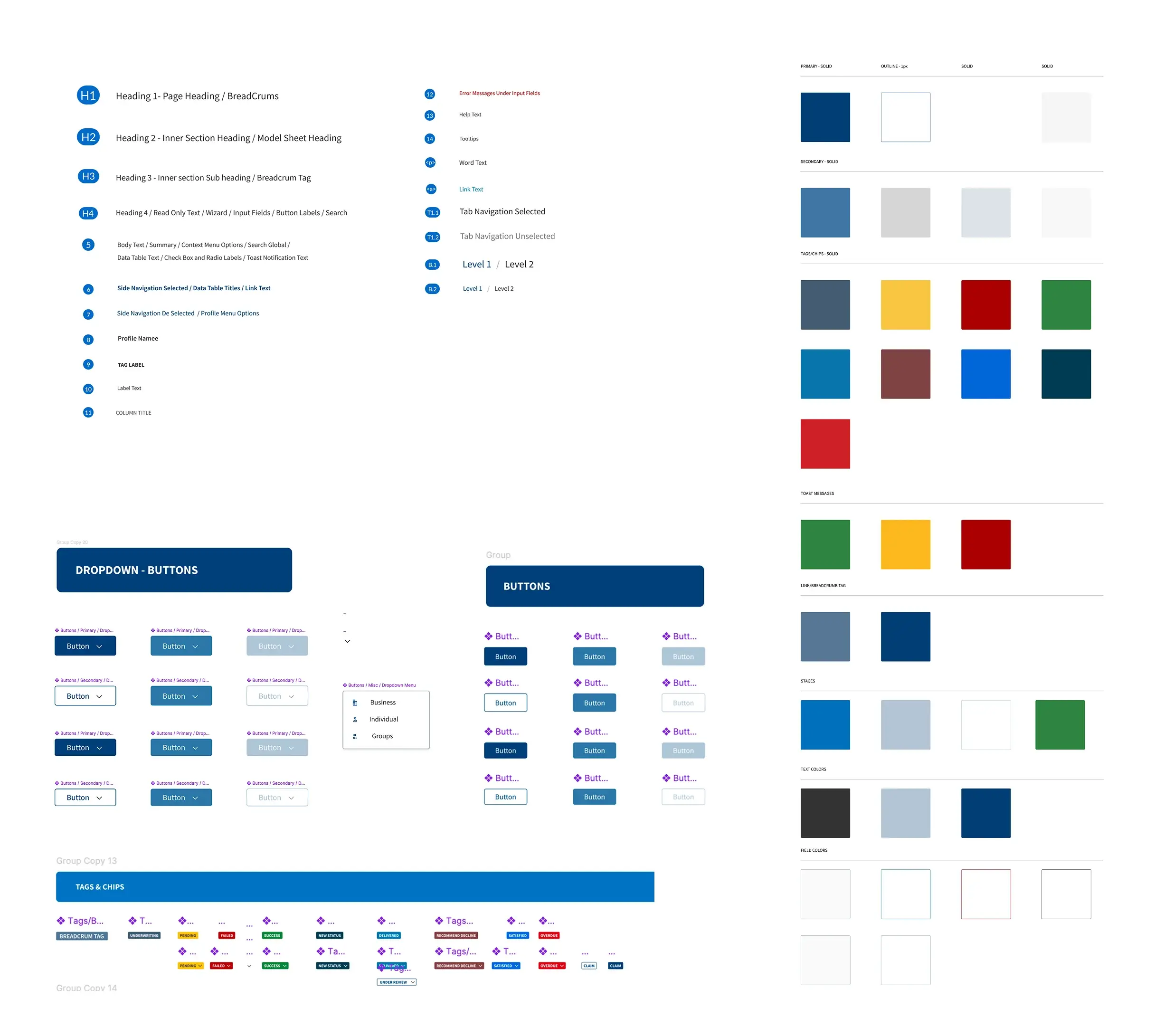
I created the design system based on Material Design principles and established UI guidelines to align the UI development team and testing team. The system covered typography, iconography, component states, spacing tokens, and interaction patterns — providing a single source of truth for the entire Infinity Assist application.
Typography Scale
Headings, subtext, body, caption, and mono — each with defined weight, size, and line-height for consistent hierarchy.
Spacing Tokens
From 4px to 64px — a systematic spacing scale that ensures visual rhythm across every component and layout.
Component States
Default, hover, active, disabled, focus, error — every component defined with all interaction states and accessibility targets.
05 — First Milestone
WCAG compliance before new features.
Keyboard Navigation
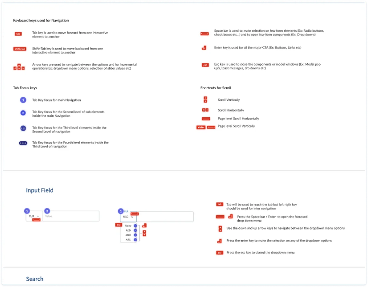
Focus Order
Color Contrast Audit
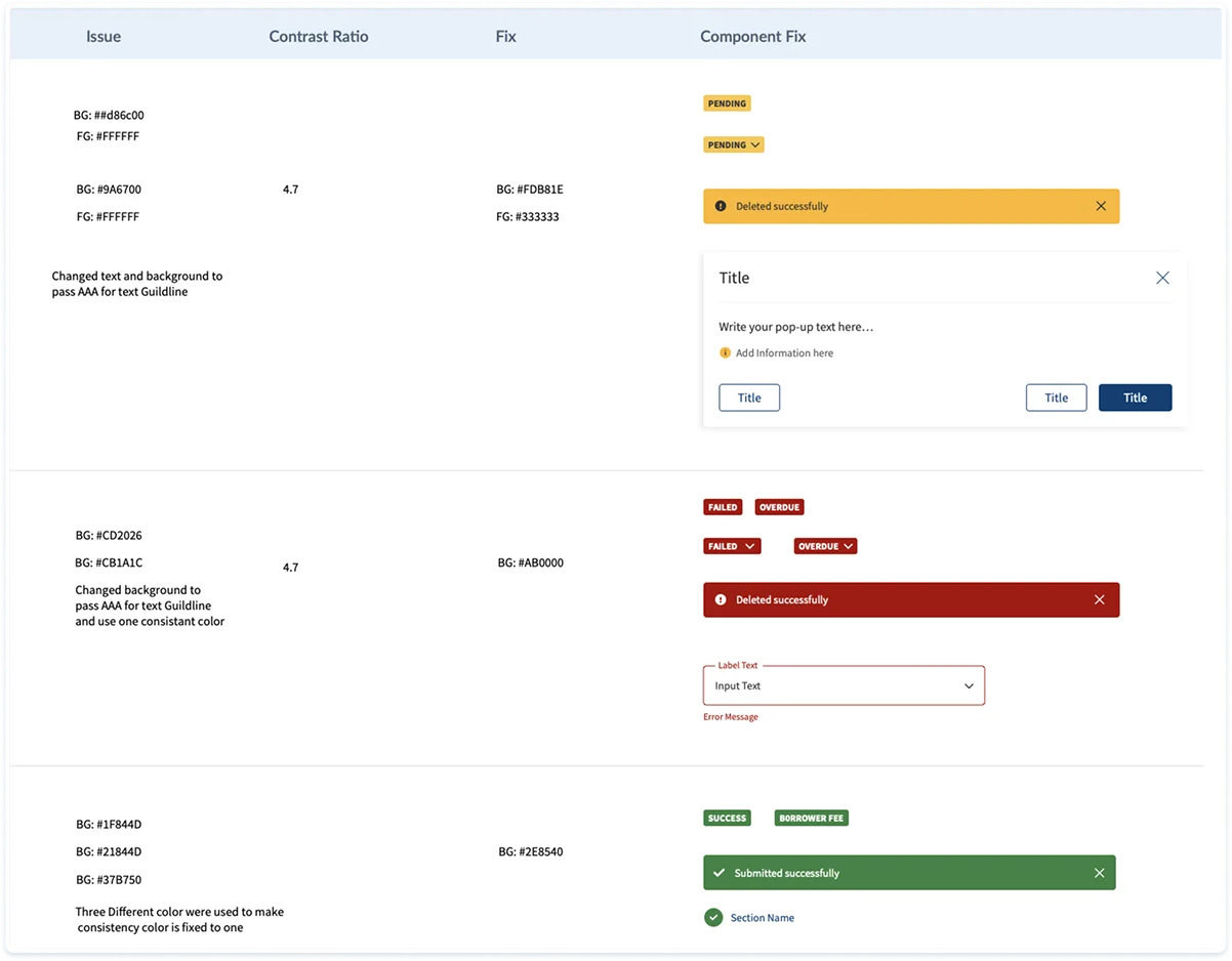
Color Contrast
Testing done for text and background to pass AAA for text guidelines. Created focus order for keyboard navigation. The navigation order of focusable elements was made to be logical and intuitive.
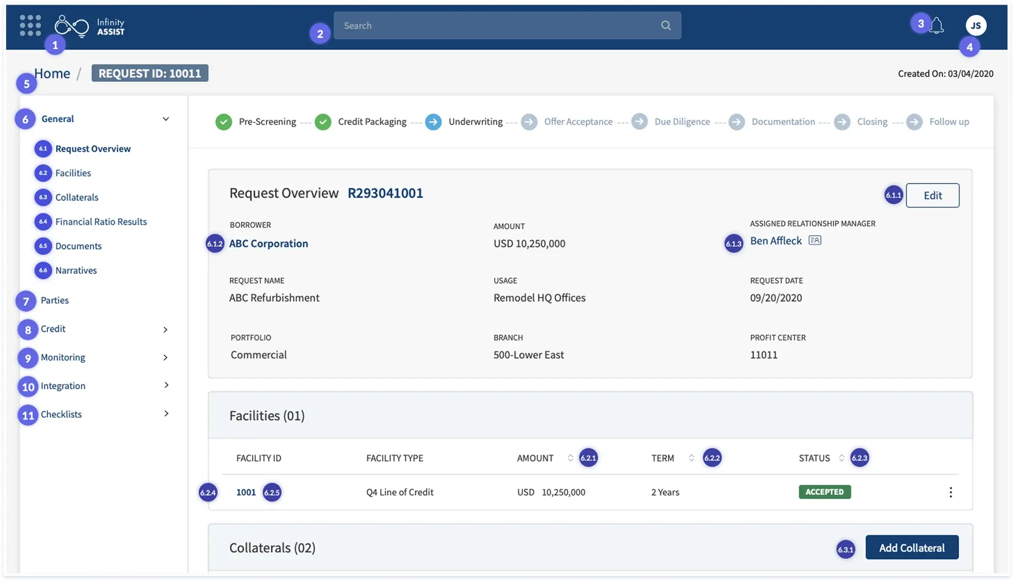
Focus Order (Part of WCAG Compliance)
06 — Design Decisions
The calls that shaped the product.
With no direct open-market competitor to benchmark against — corporate banking platforms are closed and proprietary — every significant design decision had to be grounded in domain knowledge, user workflow analysis, and systematic iteration with stakeholders.
Audit First. Design Second.
I began the engagement not with wireframes but with a systematic UI audit of the existing interface. Every reusable component was identified and catalogued before a single new screen was designed. This discipline meant the development team had immediate clarity, reduced design debt, and a component library that could scale across all five service modules from day one.
Earn Design Ownership Through Wireframes
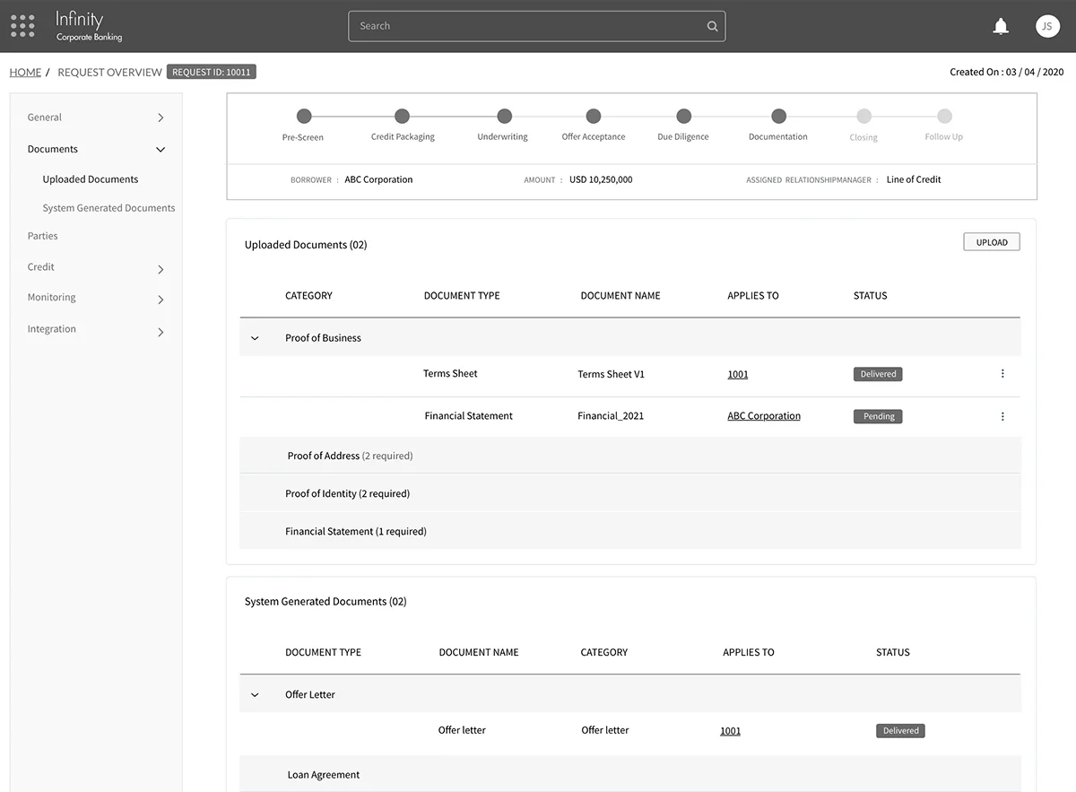
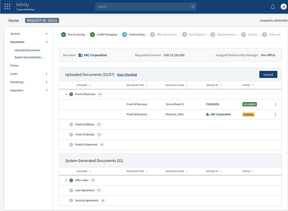
A critical inflection point was convincing stakeholders to delegate design responsibility to the UX team. Rather than waiting for permission, I used wireframes to validate flows end-to-end — demonstrating the value of the UX-led process before asking for sign-off. Once the wireframes proved their worth, the team was given full ownership to design interfaces and improve usability without constant stakeholder intervention.
Accessibility as a First-Class Deliverable
Accessibility was positioned as a milestone — not an afterthought. By making WCAG AAA compliance the first deliverable, I established the quality bar for everything that followed. Colour contrast tables, focus order documentation, and keyboard navigation flows were built into the process — not bolted on at the end.
Wireframes to Final UI
07 — Key Screens
The application in motion.
The project is in continuous improvement — managing to consolidate by increments all its views in line with the design system. Each screen went through the 4-stage workflow (In Progress → Review → Done → Done with Changes) and was tracked against the component library to maintain design consistency. Usability testing with real users was coordinated in parallel.
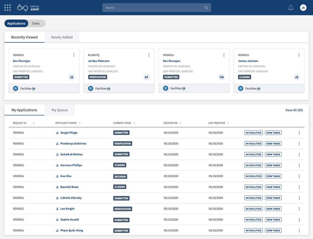
Home Dashboard — Relationship Manager View
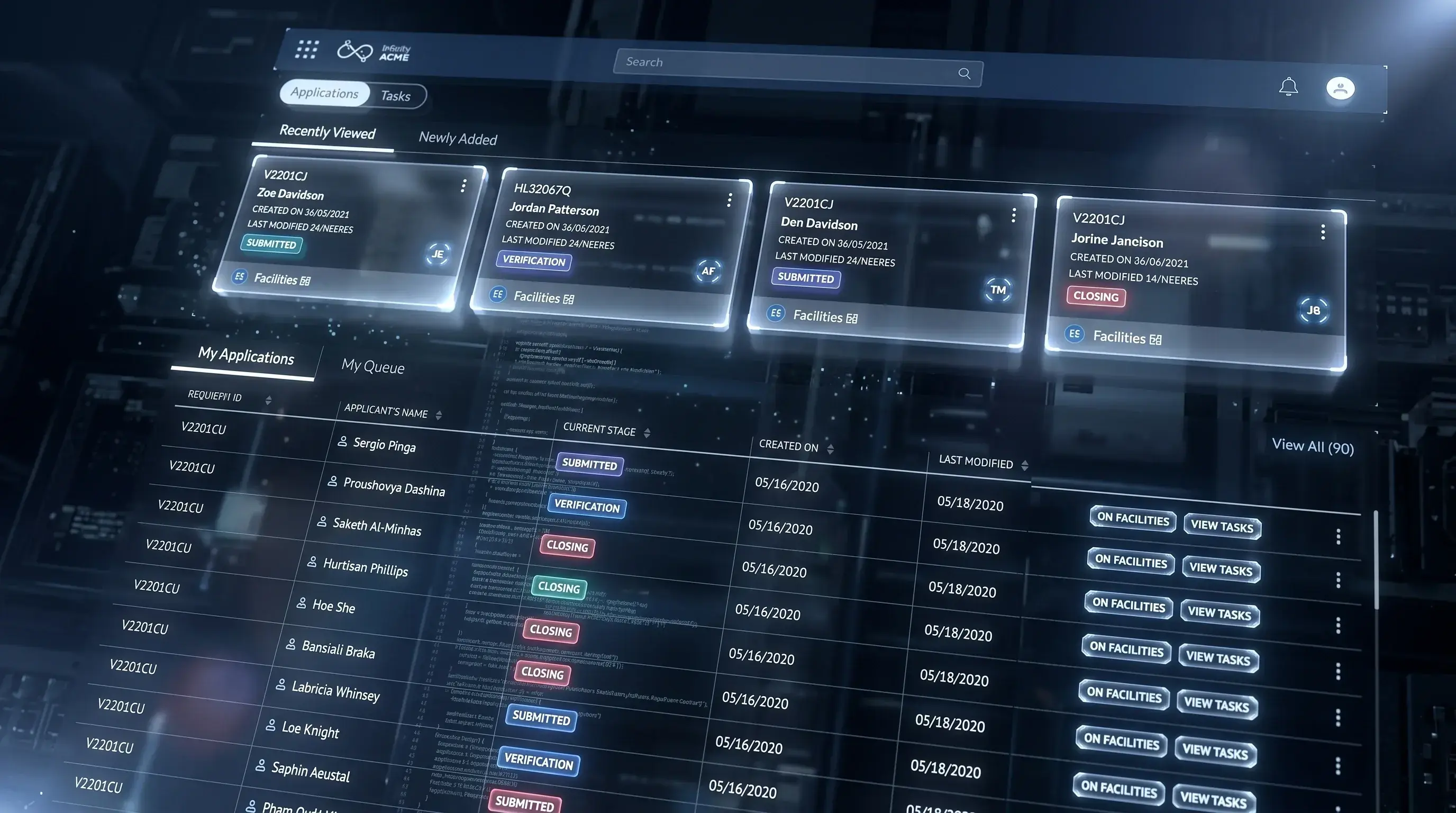
The landing experience for all user types. Recently Viewed and My Applications panels give immediate access to active work. The dark navy global nav persists across all screens.
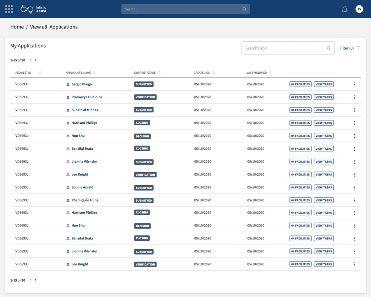
All Applications — List & Filter
The core worklist view for Relationship Managers and Credit Analysts. Status badges, sortable columns, and application-level actions are all surfaced without deep navigation.
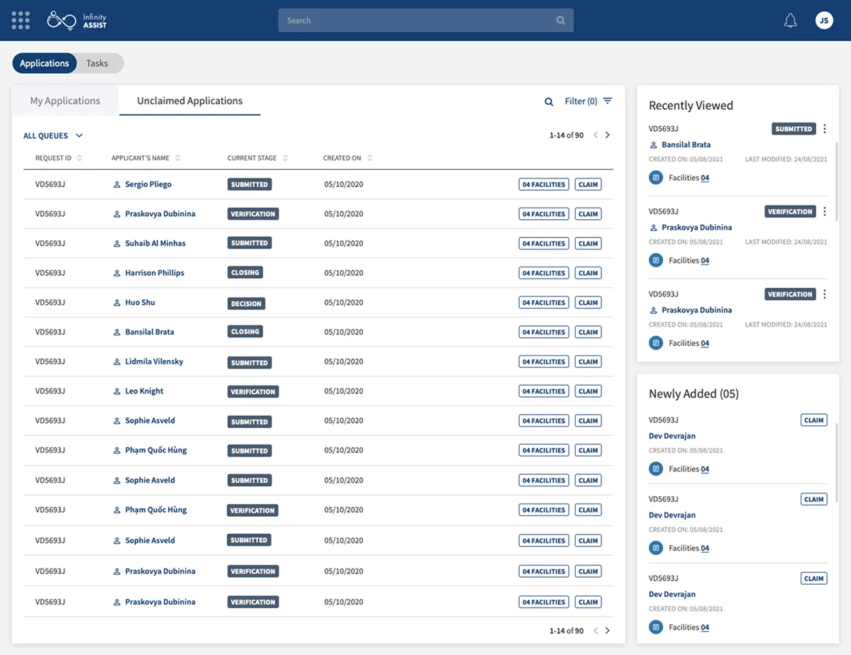
Applications — Recently Visited & Newly Added
A sidebar panel surfaces recently visited and newly added applications — keeping context without leaving the list view. Reduces navigation overhead for users managing high volumes.
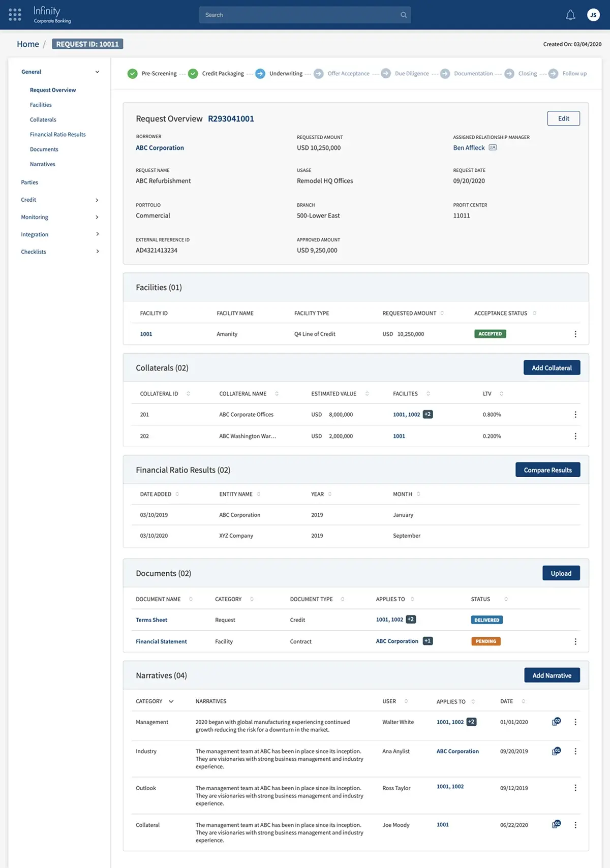
Request Overview — Comprehensive View
The deepest detail screen in the application. A stage-progress indicator shows workflow position. Collapsible panels expose Facilities, Collateral, Financial Ratios, Documents, and Narratives in a structured, scannable layout.
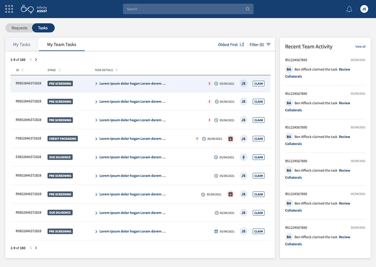
Tasks — My Tasks & Team Tasks
Task management across the team. Tabbed between My Tasks and My Team Tasks, with a Recent Activity feed providing real-time visibility into team actions without switching contexts.
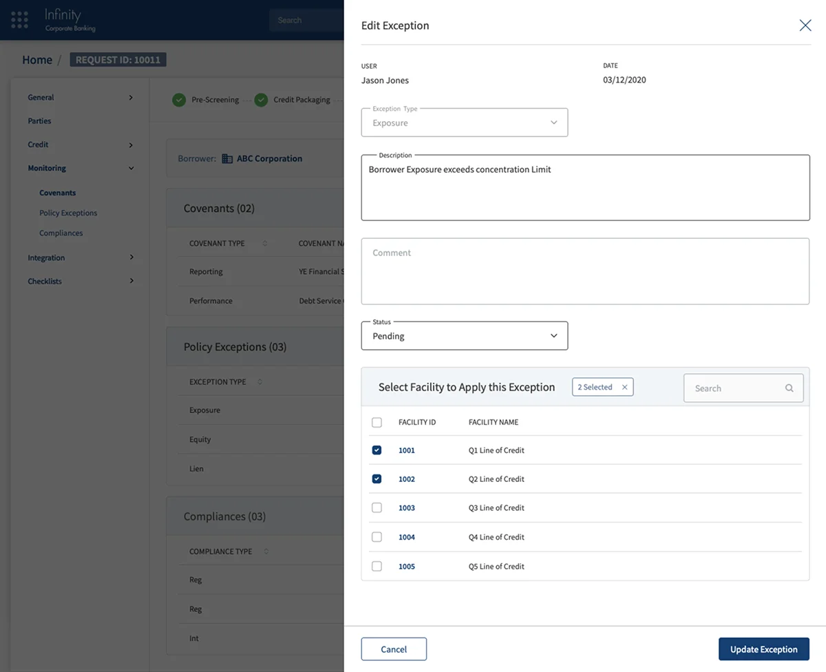
Exception Management — Overlay Panel
An exception entry panel rendered as a dark-themed overlay — providing focused input without losing the underlying task context. Facility dropdowns, exception type selection, and resolution controls in a compact, keyboard-accessible layout.
08 — Impact
Ownership earned. Shipped end-to-end.
The most significant milestone wasn't a screen count or a sprint velocity — it was the moment stakeholders handed over full design responsibility to the UX team. That trust was built screen by screen, wireframe by wireframe. The system now underpins a live corporate banking platform used by financial institutions globally.
5
Banking service modules covered end-to-end
4
User personas served by one unified system
AAA
WCAG colour contrast compliance achieved
6 mo
Full design system + UI screens delivered
09 — Reflection
What corporate banking taught me about design.
Biggest Design Win
Gaining full design autonomy mid-project was the defining moment. It changed the entire dynamic — from executing on stakeholder directives to owning the UX direction. That shift was earned through systematic wireframing that proved the value of a UX-led process before asking for trust.
What I'd Do Differently
I would front-load the stakeholder alignment on design ownership even more aggressively. The wireframe-led trust-building worked — but it added timeline pressure. Getting that agreement in the first sprint would have unlocked faster delivery across all five service modules.
What This Project Taught Me
Corporate banking UX is data management at scale. Every screen is a decision support tool. The clarity of information hierarchy — what you show first, what you defer, what you collapse — directly determines whether a credit analyst makes the right call on a £50M facility. Design consequences are real and immediate.
Tools & Methods
Sketch · UI Audit methodology · Material Design system · WCAG AAA compliance testing · Keyboard focus order documentation · Heuristic evaluation · Wireframe-to-UI workflow · 4-stage developer handoff protocol (In Progress → Review → Done → Done with Changes)