AI & Analytics Engine
- My Role
- Product UI/UX Designer
- Timeline
- 2022 – 23
- Key Metric
- 4
- Core journey stages replacing a complex node-based legacy experience
Core challenge
AI · Analytics Platform
At a glance
Final solution at a glance
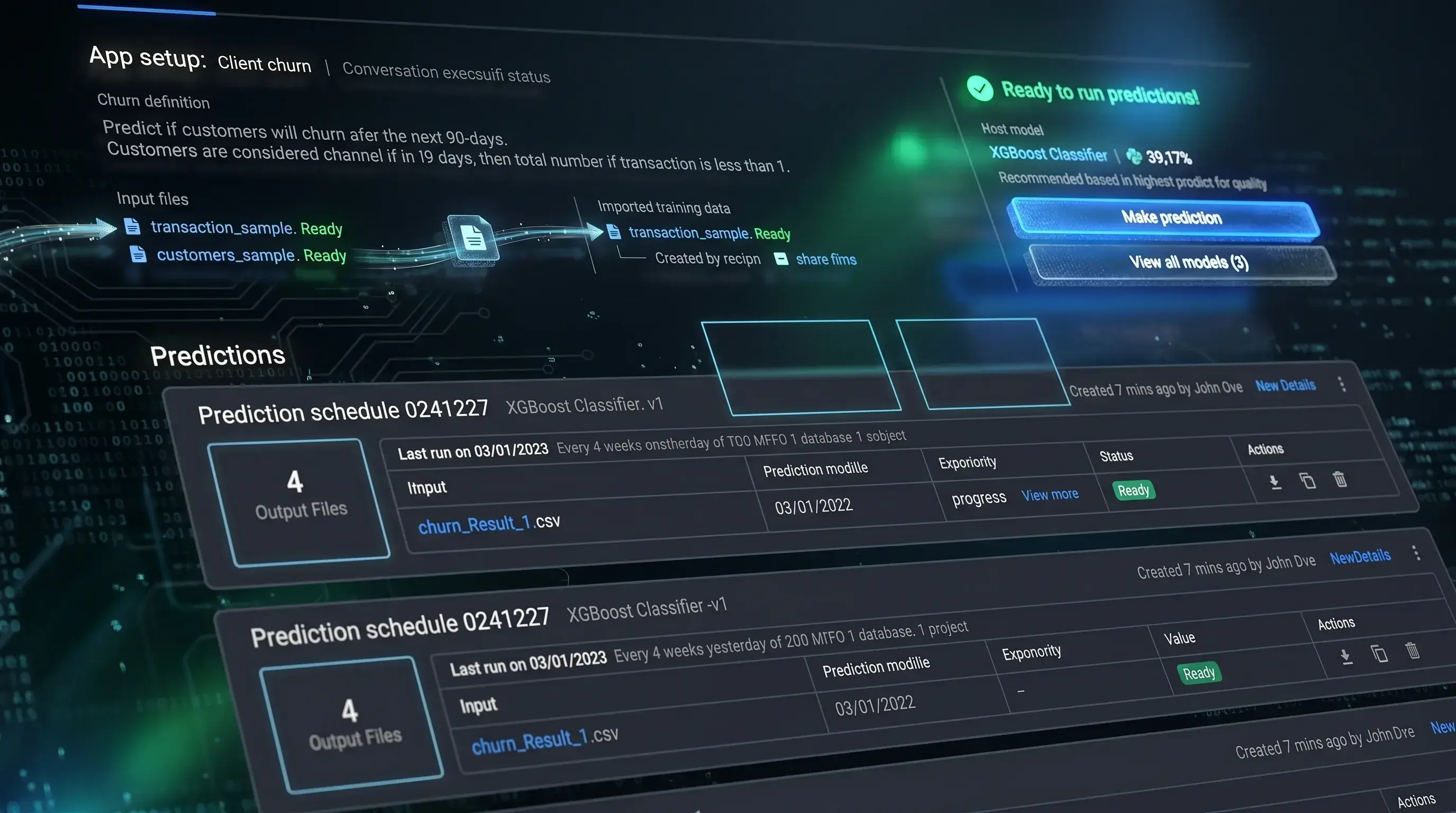
4
Core journey stages replacing a complex node-based legacy experience
2
Primary user personas served from a single unified interface
1
Design system built from scratch — colours, typography, icons, and all UI components
✓
Usability testing validated improved task completion, reduced confusion, and clearer path to value
01 — Overview
AI & Analytics Engine — What is it?
The AI & Analytics Engine (AI&AE) is a web-based machine learning platform built by PI.EXCHANGE that helps organisations quickly, easily, and affordably build predictive models and turn data into actionable decisions — without requiring deep coding expertise.
Purpose-built for anyone who works with data, the Engine guides users from raw dataset to deployed prediction model through a structured, simplified workflow. My responsibility spanned design sprints, usability testing, UI/UX design, and building the design system that unified the entire product experience.
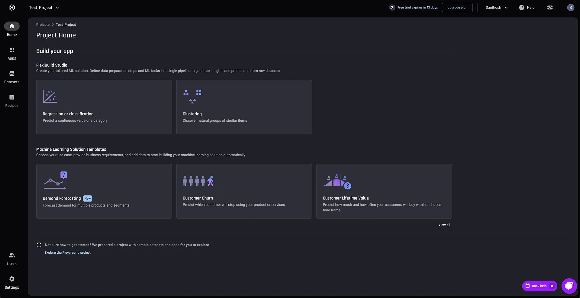
AI & Analytics Engine hero dashboard showing the main interface and workflow overview
02 — The Problem
A complex legacy design blocking user adoption.
The AI & Analytics Engine was facing significant user retention and conversion challenges. A complex, node-based legacy design combined with multiple inconsistent UX flows was fragmenting the experience — making the learning curve steep for new users and ultimately preventing trial users from converting into paying customers.
The Core Gap
"The product's capability was strong — but the experience made it inaccessible. Users couldn't find their way through the tool, couldn't trust the outputs, and couldn't see a path to value quickly enough to stay."
Complex Legacy Node-Based Design
The existing UI relied on a node-graph paradigm that required significant technical understanding to navigate — creating an immediate barrier for the platform's target users, many of whom were not ML engineers.
Inconsistent UX Flows
Multiple disconnected flows across the product created confusion about where to start, what each step meant, and how actions related to each other — fragmenting the user journey and increasing drop-off.
High Learning Curve for New Users
Trial users — often aspiring data analysts or domain experts with limited ML background — encountered too much complexity too quickly, impeding their ability to experience the platform's core value before churning.
Low Trial-to-Paid Conversion
The combined effect of friction, confusion, and steep onboarding meant users rarely reached the moments of genuine value that would justify upgrading — directly impacting business growth and revenue targets.
03 — My Role & Goals
Shaping the product from research to system.
My role involved conducting design sprints across various stages of the user journey — fostering collaboration between data scientists, engineers, product owners, sales, and marketing teams. To drive feature innovation, I facilitated workshops using affinity mapping and card sorting techniques.
I was also responsible for establishing and maintaining the AI&AE design system from scratch, ensuring cohesive visual and interaction standards across the entire product — and overseeing accessibility testing to make sure the experience worked for all users.
Enhance user experience
Improve UI clarity, UX coherence, and visual quality across the platform.
Optimise functionality
Streamline workflows and increase task completion accuracy.
Drive business growth
Boost user retention, acquisition, and conversion from trial to paid.
Measure success
Track key metrics to evaluate design performance and iterate accordingly.
04 — Design Process
A structured, iterative approach to a complex problem.
The design process followed a five-stage framework — grounding every decision in user understanding before moving to execution. Each stage fed into the next, with feedback loops built in to prevent design decisions from outpacing validated knowledge.
Understand
Identify user needs, mental models, and operational pain points through interviews, observation, and existing data analysis.
Ideate
Generate creative solutions through workshops, affinity mapping, card sorting, and collaborative brainstorming with cross-functional teams.
Prototype
Build and test initial designs — from low-fidelity wireframes through to annotated mid-fidelity and high-fidelity interactive prototypes.
Iterate
Refine based on usability testing feedback, stakeholder input, and engineering constraints — with each cycle tightening the design toward the validated solution.
Implement
Launch the final product — with comprehensive design system documentation, developer annotations, and accessibility standards built in from the start.
05 — Discovery & Research
Understanding users before designing for them.
The research phase combined qualitative and quantitative techniques to build a grounded understanding of user needs, behaviors, and pain points. User research and brainstorming sessions used affinity mapping and card sorting — conducted in Miro — to organise findings into patterns that directly informed the product direction.
This included: conducting user interviews to surface goals and pain points; observing users in natural workflows; running surveys for quantitative signal; analysing existing analytics and customer service records; and creating user personas to represent the distinct types of users the platform served.
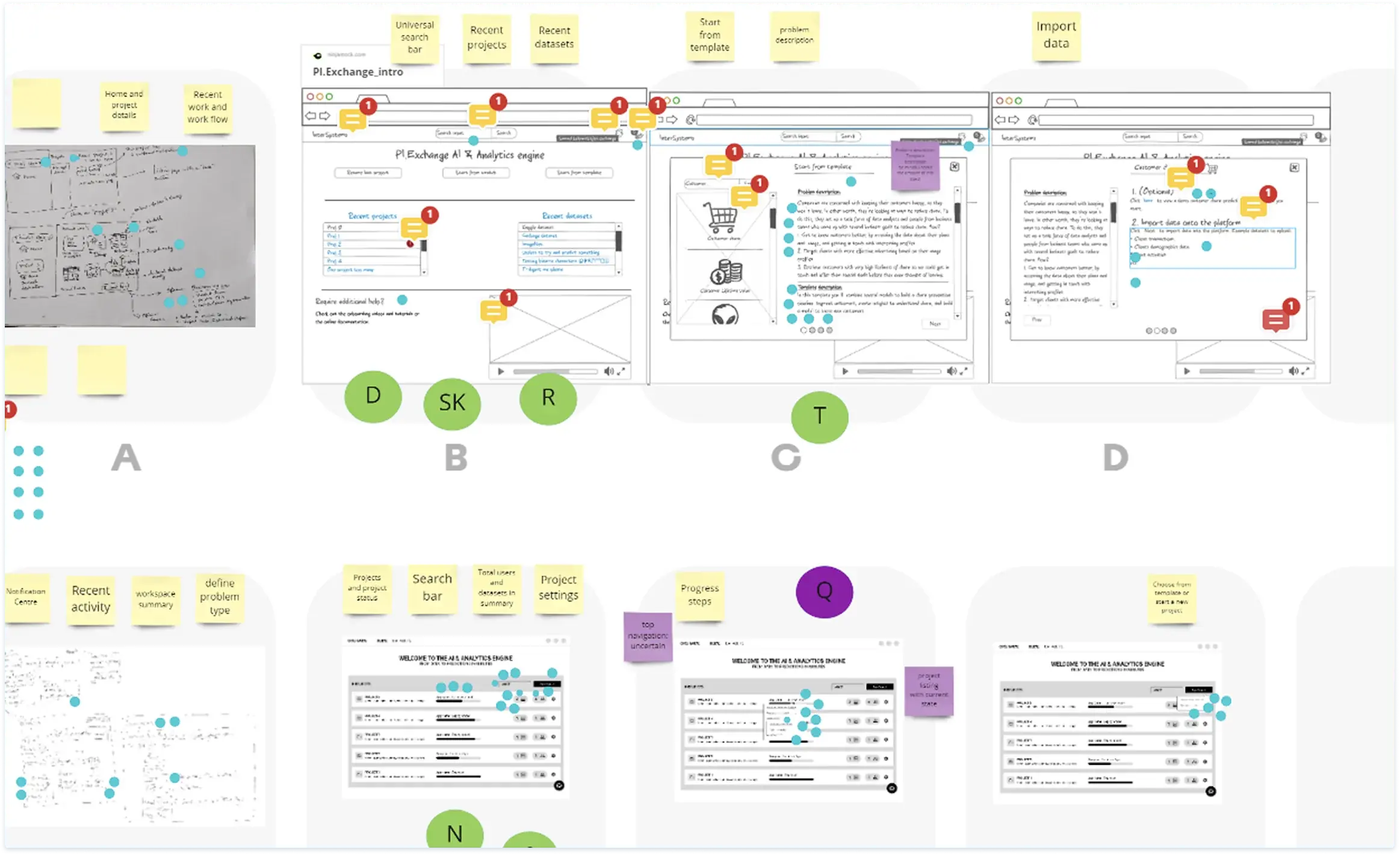
Requirements Gathering & Research Workshops — Leveraged Miro for visual ideation through affinity mapping and card sorting to organise research into actionable themes.
06 — User Personas
Two distinct users. One shared platform.
Research surfaced two primary personas with meaningfully different technical backgrounds, goals, and challenges — both of whom needed to find value in the same product. Designing for both without privileging one over the other was a core constraint of the entire project.
Experienced Data Scientist
Primary — Senior Data Scientist at a mid-sized company. Age 30–45 with a Master's in Statistics, Computer Science, or related field. Highly proficient in Python, R, SQL, TensorFlow, PyTorch, Scikit-learn with 5+ years of experience.
Pain points
- Time-consuming data preprocessing and cleaning routines
- Difficulty finding optimal model parameters efficiently
- Lack of efficient monitoring and experimentation tools
- Explaining complex models to non-technical stakeholders
Goals
- Develop and deploy accurate, scalable machine learning models
- Automate routine data preprocessing and pipeline tasks
- Access scalability for large datasets
- Seamless collaboration and compatibility with existing data pipelines
Aspiring Data Analyst
Secondary — University student pursuing a degree in Data Science or related field. Age 22–25 with strong foundation in statistics and programming. Proficient in Python, SQL, and basic data visualisation tools.
Pain points
- Lack of access to real-world datasets for practical experience
- Difficulty understanding complex machine learning concepts
- Limited knowledge of data preprocessing and feature engineering
- No structured path from learning to practical application
Goals
- Learn and apply machine learning techniques to real-world problems
- Build a portfolio through hands-on data analysis projects
- Access intuitive tutorials and step-by-step instructions
- Use pre-built templates to accelerate model development
07 — User Flow
Mapping the full journey from sign-up to prediction.
Before any screen design began, I mapped the complete user flow — from onboarding entry through to model deployment and export. This gave the team a shared understanding of every decision point, branching path, and moment where users could get lost or drop off. The flow directly shaped the simplified UX architecture that followed.
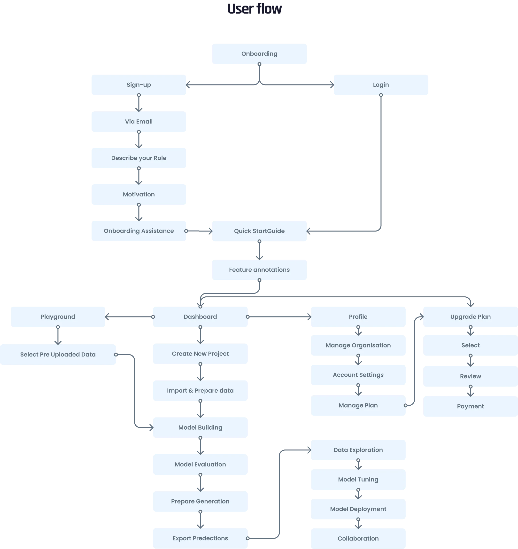
End-to-End User Flow — Full journey from onboarding and sign-up through model building, evaluation, and prediction export — with all branching paths mapped.
08 — First Milestone: Wireframes
Structural clarity before visual polish.
The first milestone focused on creating simple, clear UI wireframes that outlined the application's structure and core functionality. These served as a foundational blueprint — aiding developer comprehension and enabling early feedback before any visual design investment. Wireframes prioritised user experience and information hierarchy, and were meticulously labelled and annotated for handoff clarity.
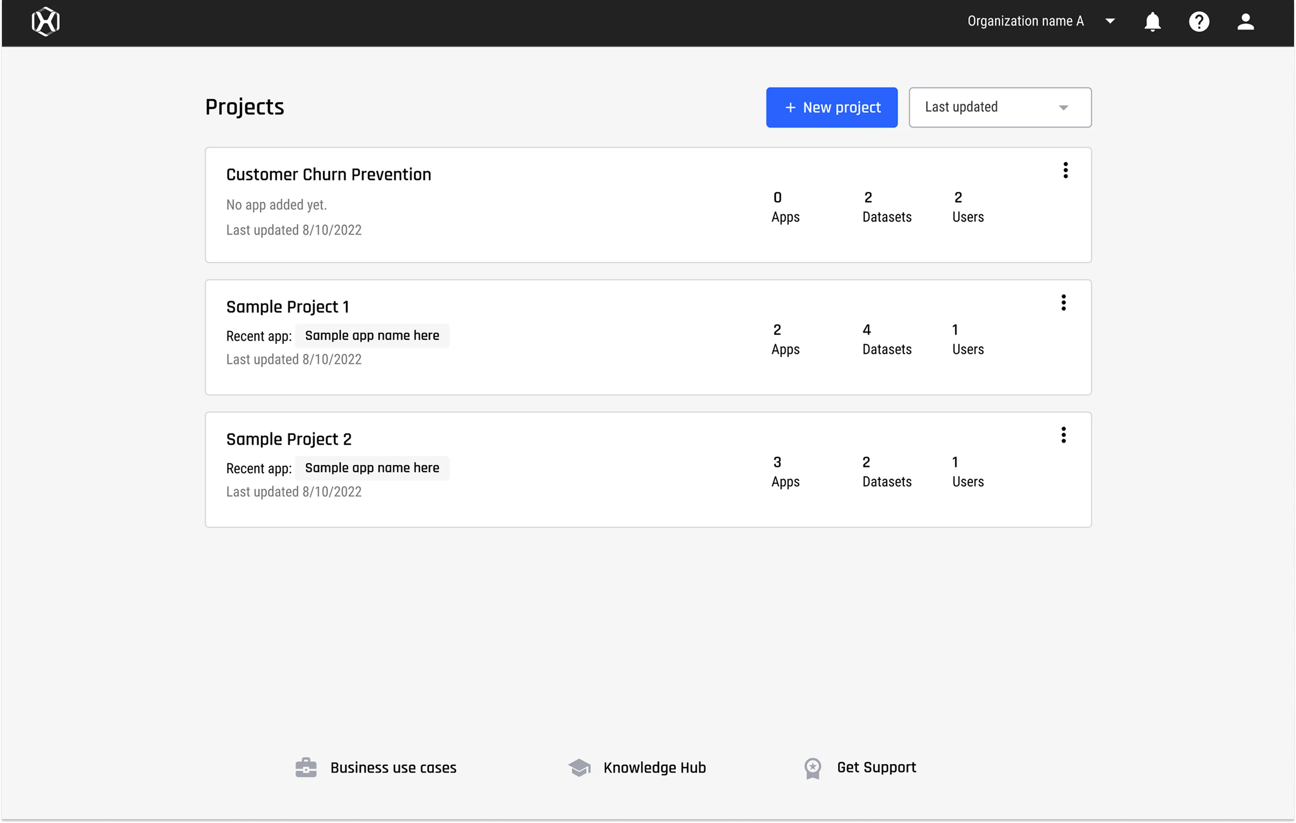
Projects List — Wireframe
Entry point for returning users — project overview with status tracking and quick navigation.
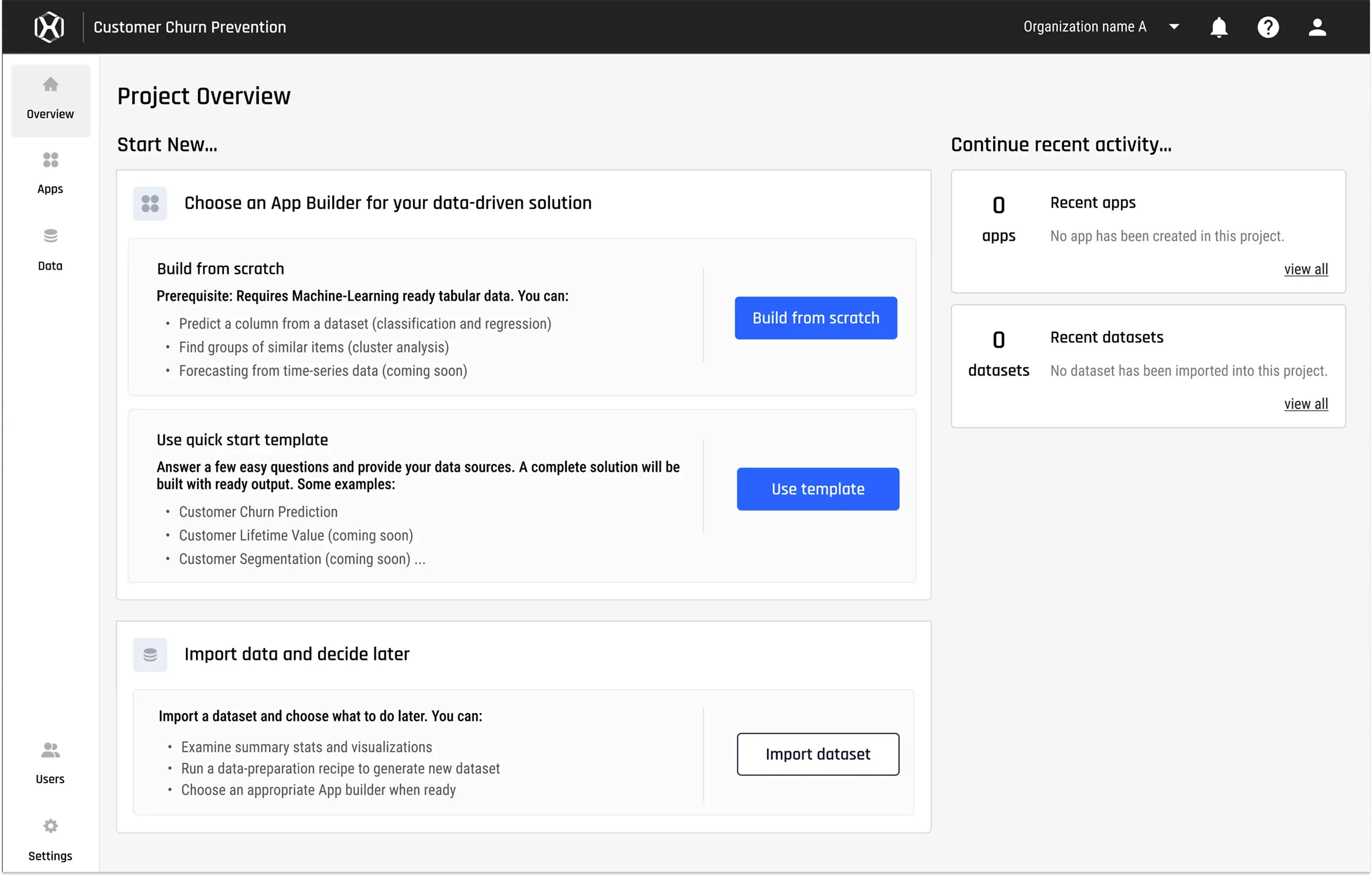
Project Overview — Wireframe
The starting point for new projects — three clear paths: build from scratch, use a template, or import data.
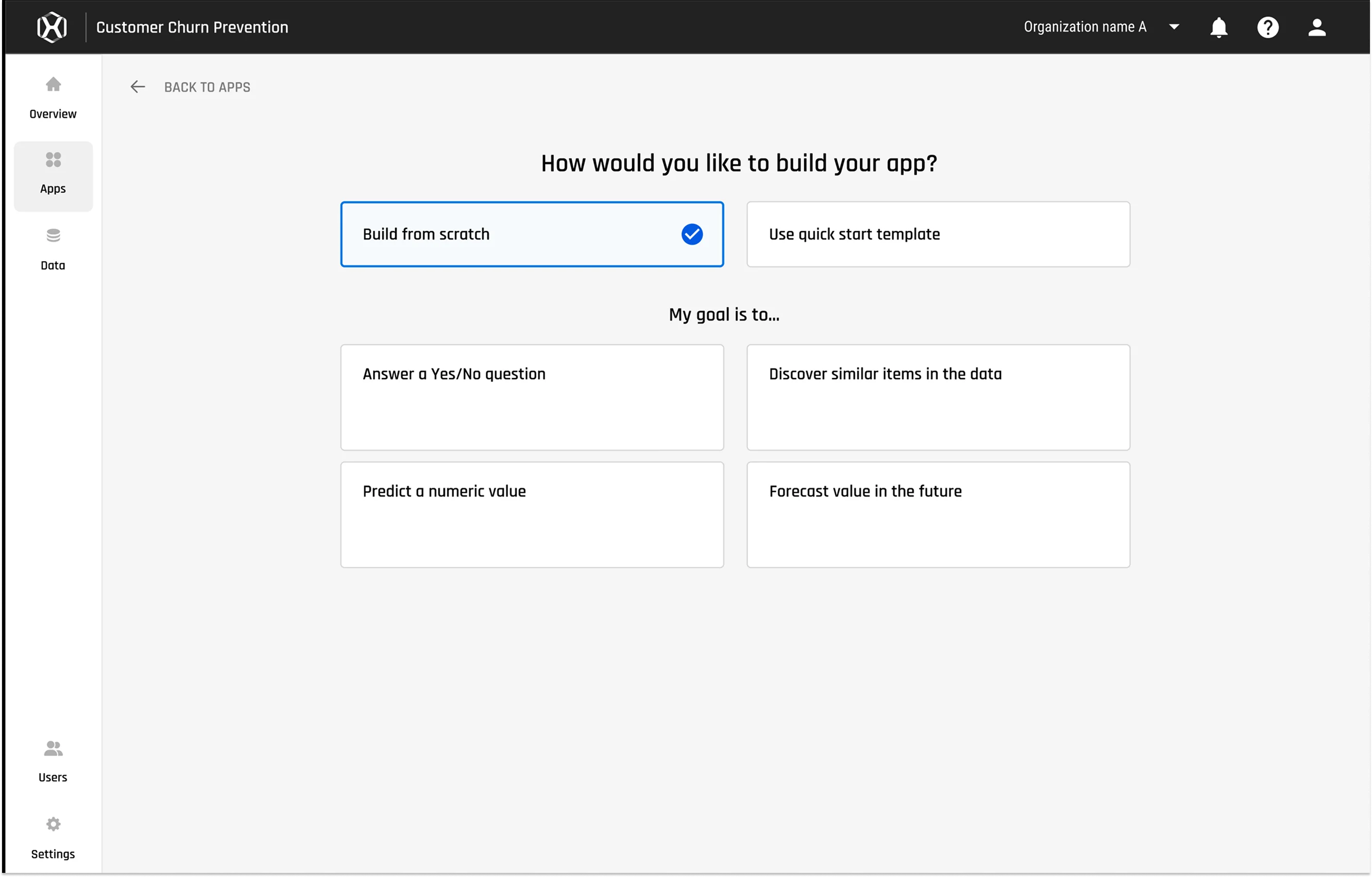
App Builder — Goal Selection
Guided path for new users — selecting a prediction goal before configuring the model.
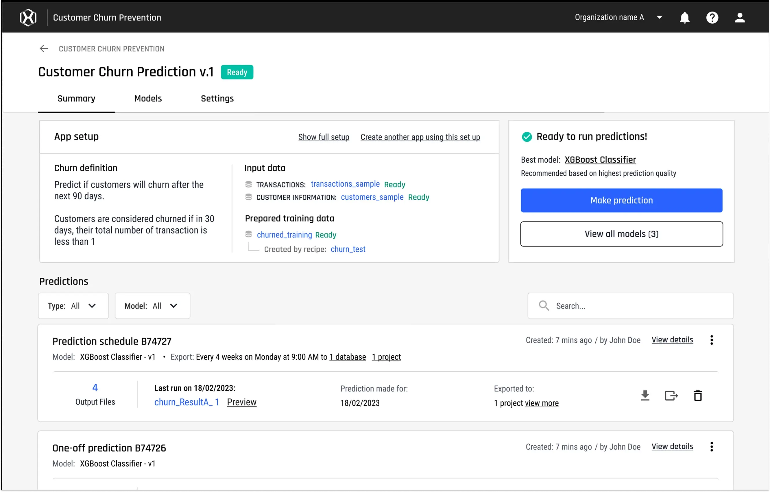
Model Summary — Wireframe
Model detail view — definition, current predictions, churn definition, and performance summary at a glance.
09 — Design System
A flexible, scalable system built from scratch.
The AI&AE design system is a comprehensive set of guidelines and components used consistently across the entire product to ensure a cohesive user experience. It covers typography, colour schemes, spacing, interactive components, and accessibility standards — making it straightforward for both designers and developers to use, extend, and maintain.
The system was designed to be flexible enough to accommodate the product's evolving needs, well-documented for easy implementation, and grounded in accessibility testing to ensure it worked for all users across all states.
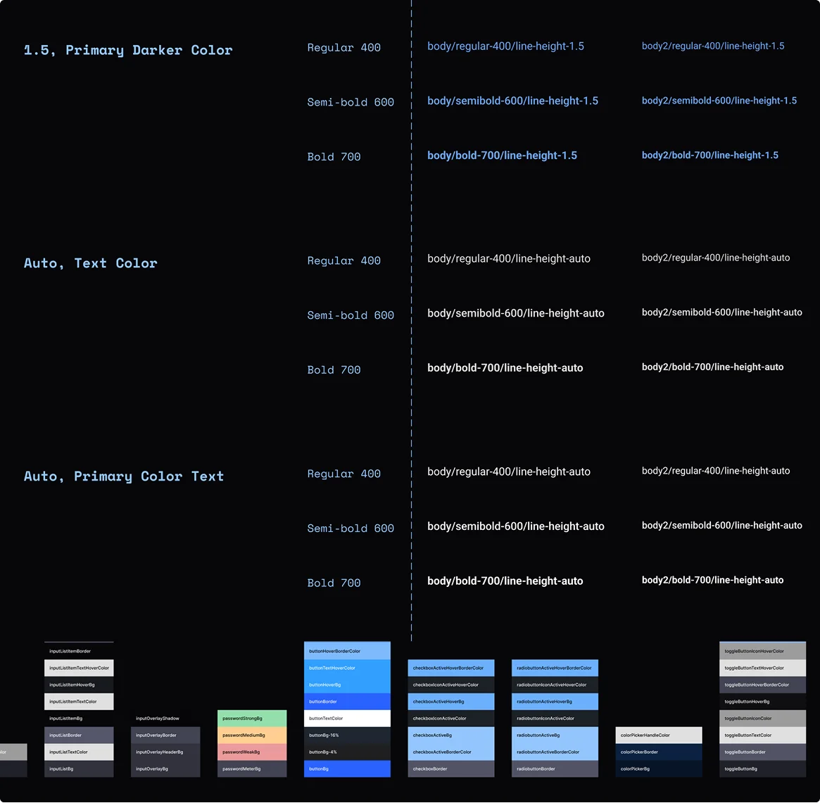
Colour & Typography
Colour tokens, type scale, and spacing system forming the visual foundation of AI&AE.
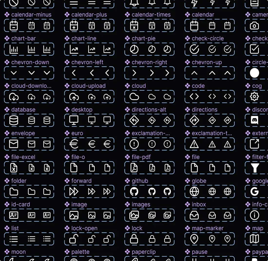
Icon Library
A unified icon set covering all core product actions, states, and data types.
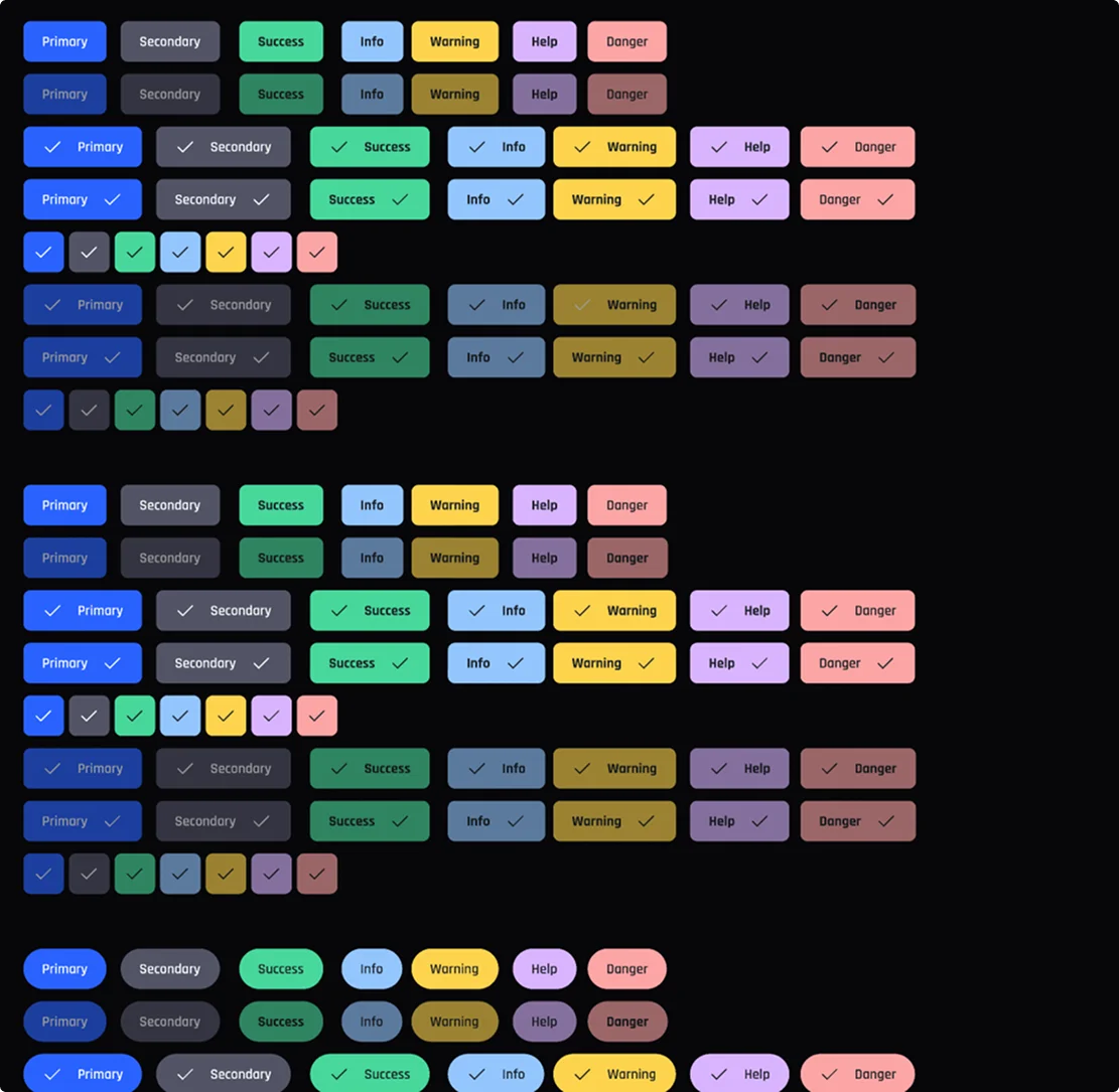
UI Component Library
Buttons, forms, cards, and interactive components — all states documented and ready for production.
10 — Next Milestone: High-Fidelity UI
From wireframe to polished, production-ready screens.
To create high-fidelity UI screens from wireframes, I followed a structured progression: adding colour, typography, and branding to give screens a professional finish; incorporating real content — text, images, and data — to make mockups accurate and stakeholder-ready; gathering user feedback and iterating; and adding animations, hover states, and micro-interactions to add realism and operational clarity.
Real-time collaboration tools kept the team and stakeholders aligned throughout — with every iteration reviewed and refined before moving to the next fidelity level.
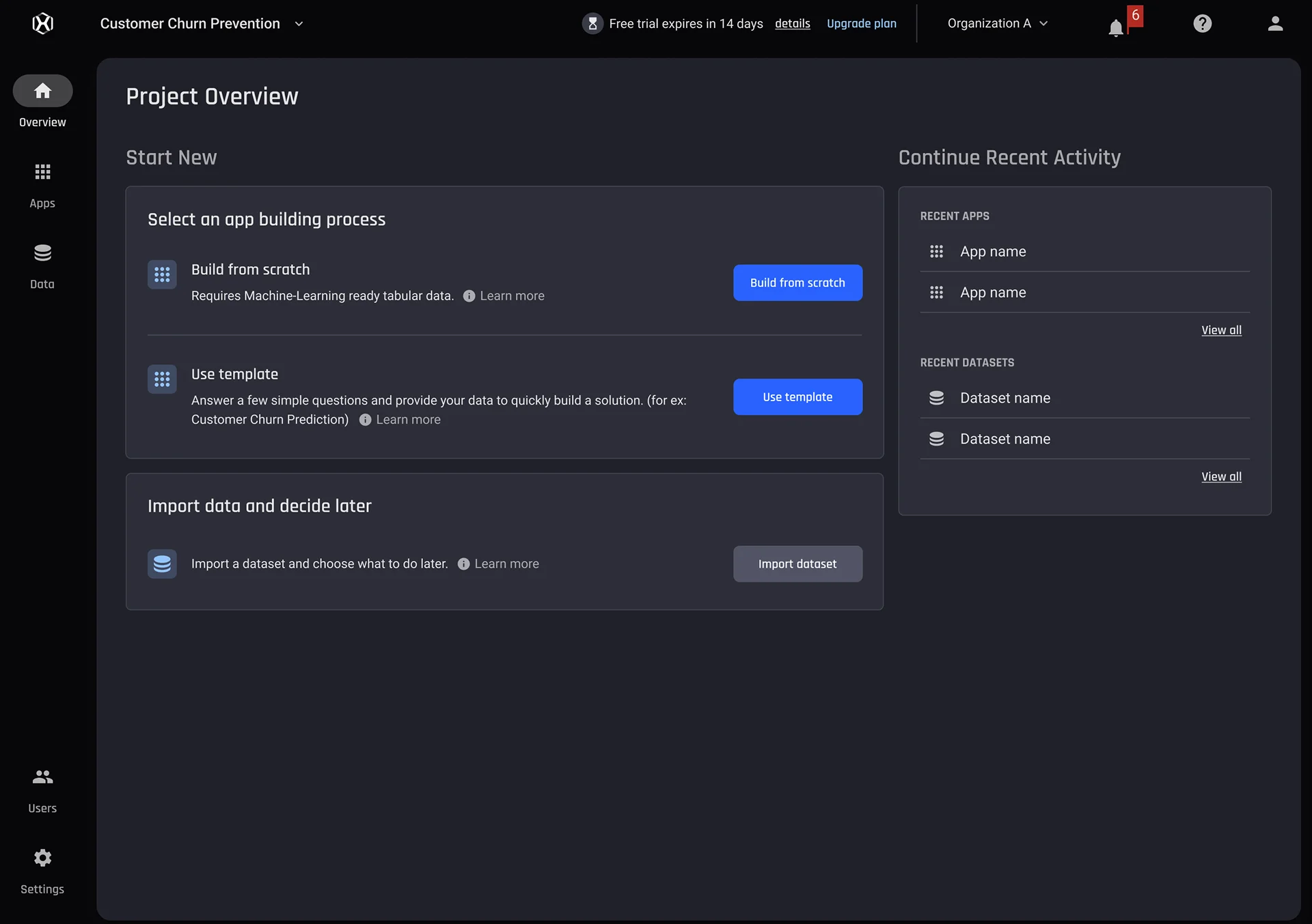
High-fidelity UI showing polished interface with colour, typography, and interactive states applied to core workflows
11 — Key Design Decisions
Three decisions that defined the simplified experience.
The redesign was grounded in simplifying a technically complex product without removing the capability that expert users needed. Every major decision had to serve both personas simultaneously — the experienced data scientist and the aspiring analyst — without designing separate products for each.
Simplified UX — Four Clear Stages
The entire user journey was restructured into four sequential stages: Prepare data. Build ML models. Interpret and understand models. Generate and export predictions. This linear progression replaced the non-linear, node-based legacy experience — giving users a clear mental model of where they were, what came next, and what each stage required of them. The structure worked for both expert and novice users: experts could move quickly; newcomers had guardrails at every step.
Explainability Built Into Every Model View
One of the platform's core differentiators was making ML model behaviour understandable to non-technical stakeholders. I designed explainability as a first-class feature — not a technical afterthought. Every model view surfaced performance metrics, confusion matrices, feature importance scores, and what-if analysis tools in accessible, non-jargon language. The goal: a domain expert who has never trained a model should be able to understand what it's doing and trust its outputs.
Guided Onboarding That Adapts to User Role
New users were asked to describe their role and motivation immediately after sign-up — not as a profiling exercise, but to personalise the onboarding assistance, quick-start guide, and feature annotation experience they received. An experienced data scientist and an aspiring analyst would see the same product but encounter it through a different introductory lens. This reduced early drop-off by ensuring users quickly reached the features most relevant to their specific context.
12 — Simplified UX: Core Flows
Four stages. One coherent experience.
The simplified UX divided the entire user journey into four major sections — each designed to be approachable on entry but capable at depth. Every stage surfaced the right controls for the right moment, without overwhelming users with complexity they hadn't yet needed.
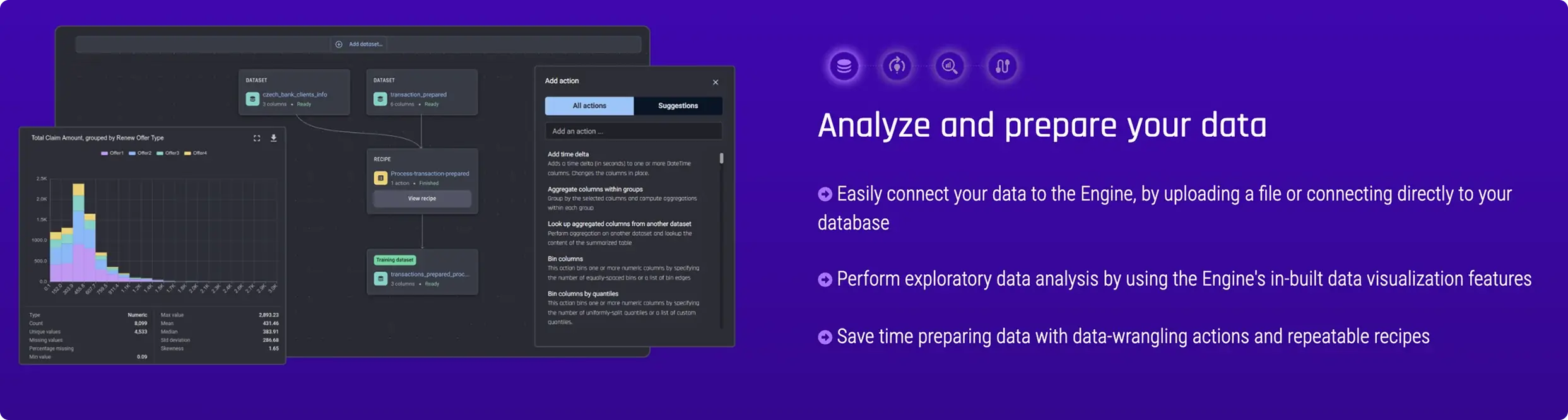
Analyse & Prepare Your Data
Connect data via file upload or direct database connection. Perform exploratory analysis using built-in visualisation tools.
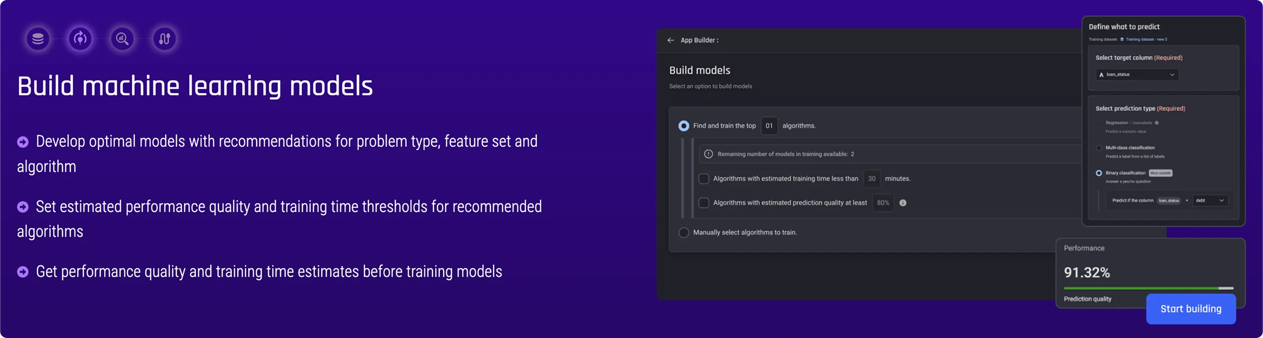
Build Machine Learning Models
Develop optimal models with algorithm recommendations. Set performance quality and training time thresholds.
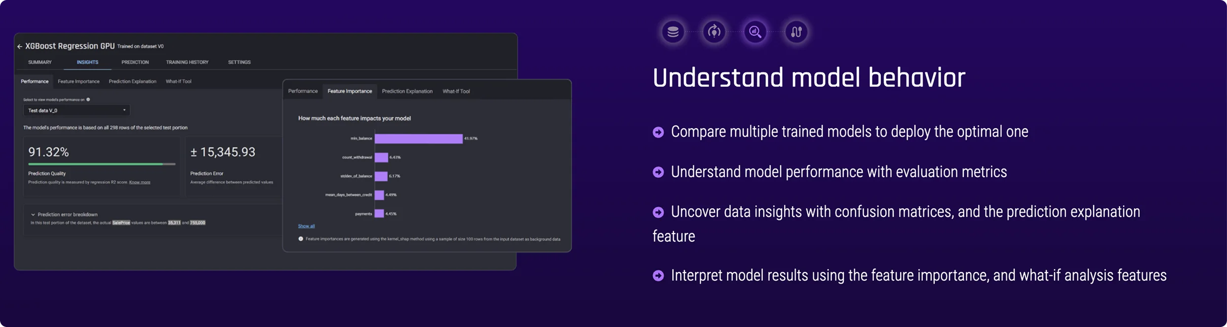
Understand Model Behaviour
Compare trained models and interpret results using evaluation metrics, confusion matrices, and what-if analysis.
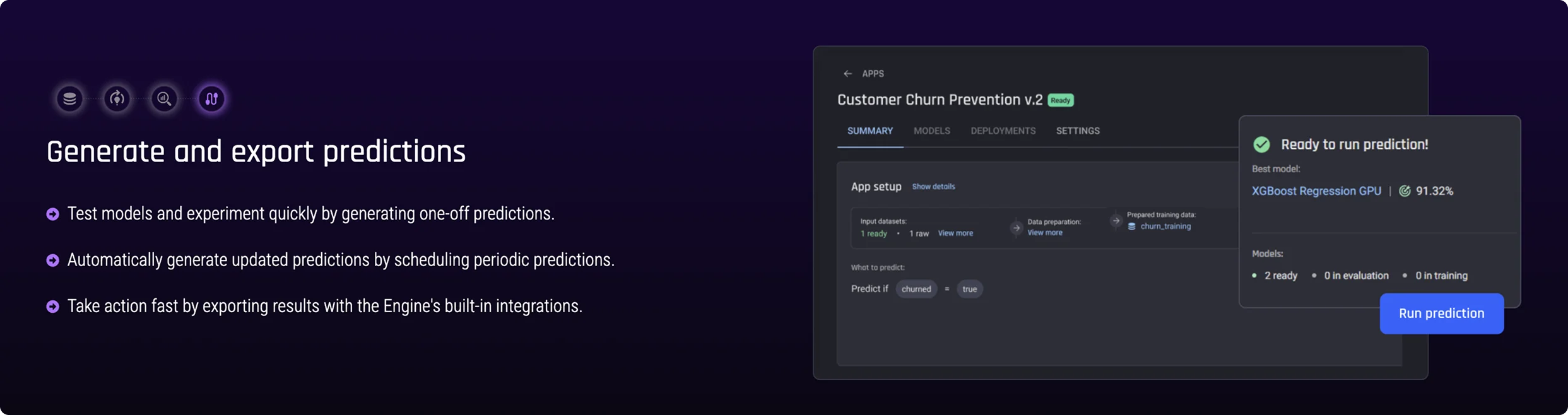
Generate & Export Predictions
Run one-off predictions or schedule automated updates. Export results directly using built-in integrations.
13 — Final UI Screens
The complete interface in production.
The AI&AE visual design applied principles of contrast, hierarchy, and balance to create an aesthetically clear and easy-to-understand interface. Colour, typography, and imagery choices were grounded in understanding the audience — enterprise data teams and aspiring analysts — and the high-stakes nature of the decisions the product supported.
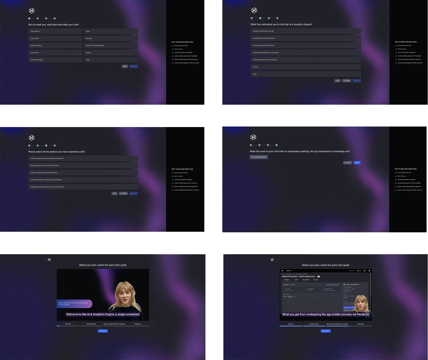
Onboarding
Entry experience with role-adaptive onboarding path and personalisation.

Upgrade Plan — Plan Selection & Checkout
Clear plan comparison, straightforward review, and frictionless payment — designed to convert trial users.
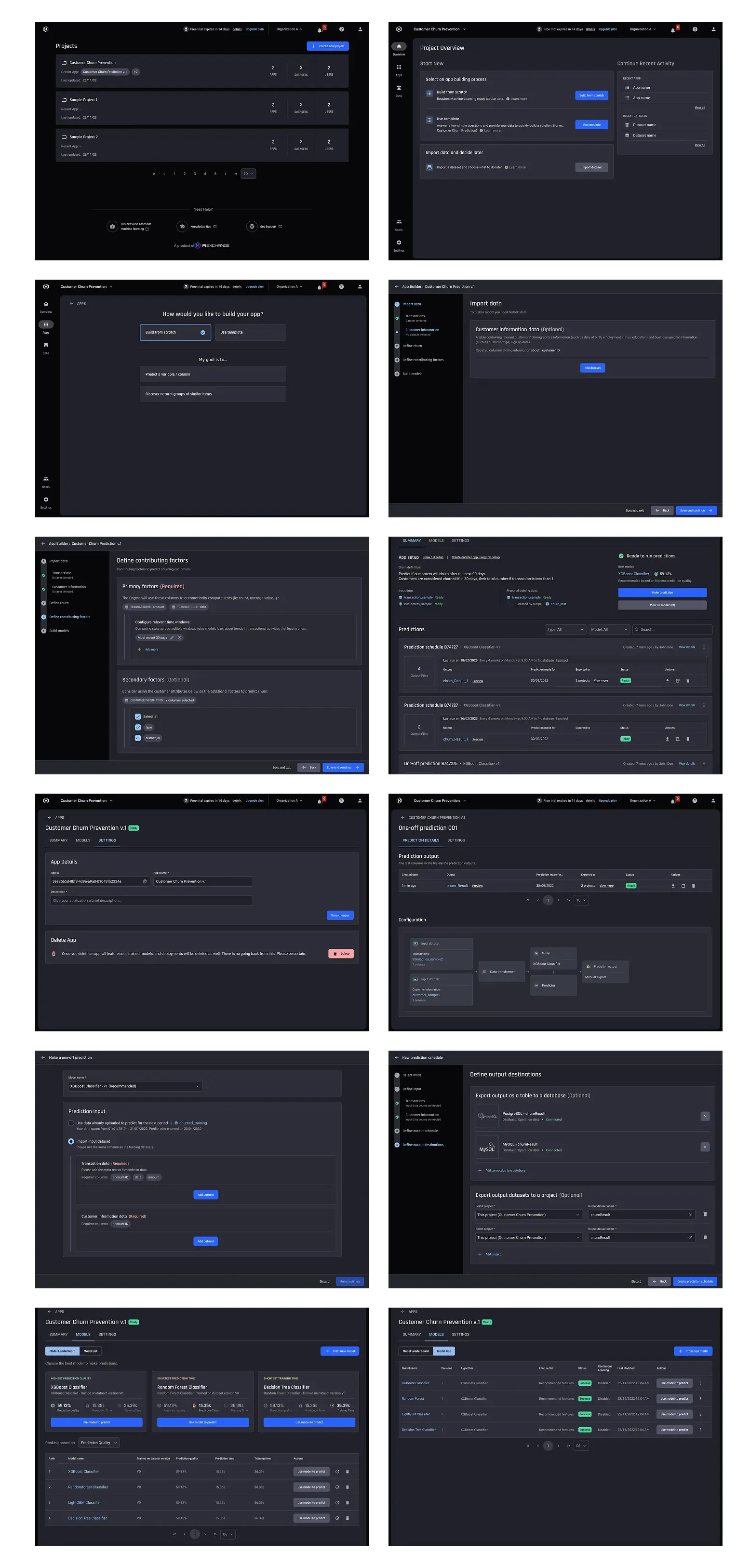
Dashboard & Product Core — Full Screen Set
The complete set of production UI screens covering all major workflows.
14 — Impact
A complex product made approachable.
The redesign transformed a technically capable but user-hostile product into an accessible, structured experience that users could navigate with confidence from day one. The combination of simplified UX architecture, role-adapted onboarding, and explainable model views addressed the core retention and conversion challenges that motivated the project.
4
Core journey stages replacing a complex node-based legacy experience
2
Primary user personas served from a single unified interface
1
Design system built from scratch — colours, typography, icons, and all UI components
✓
Usability testing validated improved task completion, reduced confusion, and clearer path to value
15 — Reflection
What I learned designing at the intersection of AI and accessibility.
Proudest Contribution
Building the AI&AE design system from scratch — establishing the visual language, component library, and accessibility standards that unified the entire product. Starting from nothing and producing a system flexible enough to serve both expert and novice users, while being straightforward for developers to implement, was the most complete design challenge of this engagement.
Biggest Challenge
Designing explainability UX for ML outputs. Making model behaviour — performance scores, feature importance, confusion matrices — genuinely understandable to non-technical users required deep collaboration with data scientists to understand what each metric actually meant, and then rethinking how to communicate it without jargon or information overload.
What I'd Do Differently
Involve domain experts — data scientists and actual end users — earlier and more continuously in the design validation process. Some explainability decisions were made based on assumed understanding rather than observed behaviour. Earlier and more frequent usability sessions specifically around model interpretation would have produced sharper solutions faster.
Tools & Methods
Figma · Miro · Affinity mapping · Card sorting · User interviews · Usability testing · Accessibility testing · Cross-functional workshops with data scientists, engineers, product owners, sales, and marketing · Design system documentation · Iterative prototype feedback loops